Preview image. Unlock full-res
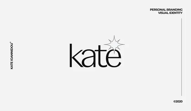
Minimalist personal branding identity featuring a sans-serif wordmark with a geometric star mark and supporting vertical axis.
Summary
A minimalist personal identity for "kate" combining a sans-serif wordmark with a geometric star accent, arranged with supporting vertical typography and a right-edge line accent on a light gray background.
Visual description
On a light gray field, the primary wordmark "kate" is rendered in a clean, unadorned sans-serif typeface centered horizontally. A geometric star outline floats directly above and slightly right of the mark. The name "KATE" is repeated vertically along the left edge in the same typeface. A thin vertical line extends from top to bottom on the right edge. The entire composition is framed with minimal spacing. A copyright mark appears at bottom right.
Key takeaway
The power of a simple geometric shape (star) as a memorable accent; vertical repetition of the name creates rhythm and reinforces the mark; the restraint of two-color, one typeface approach elevates the design's sophistication.
Reuse notes
Ideal for creative professionals, consultants, and personal brands seeking a memorable yet professional identity. The geometric star is distinctive and scalable across applications. Works well on business cards, digital profiles, and stationery. The monochromatic approach ensures versatility across media and ensures legibility at any size.