Preview image. Unlock full-res
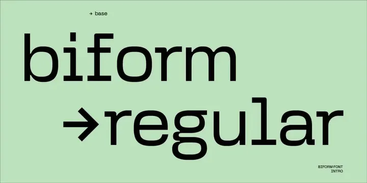
Type-specimen slide for the Biform font showing oversized lowercase 'biform' and 'regular' lockups with arrow cues, set in black on a soft mint-green field.
Summary
A single specimen frame introducing the "Biform" grotesque: the word set huge and lowercase, with a labeled "regular" weight line preceded by a long right-arrow, all in black on pale mint.
Visual description
The background is a flat soft mint green. A small "-> base" label sits top-left in a tiny bold grotesque. Dominating the frame, the word "biform" runs nearly edge to edge in a clean lowercase sans-serif. Directly beneath, a long horizontal right-arrow leads into the word "regular," also oversized and lowercase, naming the weight. A small two-line caption "BIFORM FONT INTRO" anchors the bottom-right corner in all-caps. Everything is rendered in a single black ink with no decoration, letting the letterforms and the wide negative margins carry the composition.
Key takeaway
Use a long drawn arrow glyph as a typographic connector that both points to and labels the weight name, making the specimen feel like a system rather than a single word. Setting the type oversized in one ink on a soft tinted ground keeps a specimen calm while still showing the font at display scale.
Reuse notes
A reusable template for any font-release or type-foundry announcement slide. The tinted pastel ground softens the high-contrast black type for social or deck use. Swap the mint for a brand tint and reuse the corner-label plus arrow-connector structure across a full weight set.
More like this



Keep what you find
A free account saves references to boards and can send you a weekly email of picks based on what you save.
To see every result, go Pro.