Preview image. Unlock full-res
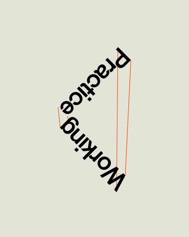
Typographic mark setting 'Working' and 'Practice' rotated and mirrored so the words and two thin orange lines build a folded triangular form on a warm grey field.
Summary
A typographic composition where the words "Working" and "Practice" are rotated and set head-to-tail in bold sans-serif so they form two sides of a triangle, closed by a single thin orange line.
Visual description
On a warm pale-grey ground, two words in a heavy black sans-serif are tilted off the horizontal and arranged so "Practice" runs down one diagonal and "Working" runs back up the other, meeting near the lower point so the baselines define the two long sides of a tall, narrow triangle. A thin orange stroke traces the third side and a second short orange line marks an inner edge, the only color in the frame. The lettering reads as a folded or hinged form, with most of the canvas left as empty grey space around the compact diagonal cluster.
Key takeaway
Use the baselines of two rotated words as the literal edges of a geometric shape, letting thin accent rules close the figure so the type both reads and draws. A single orange line against an all-black-and-grey scheme is enough to make a structural type study feel intentional rather than chaotic.
Reuse notes
A poster, cover, or studio-mark idea for design-led, editorial, or coaching brands that want type to behave architecturally. The diagonal lock means it works best as a square hero image with lots of surrounding space. Legibility drops because words are rotated, so pair it with a plainly-set name elsewhere in the system.
More like this





Keep what you find
A free account saves references to boards and can send you a weekly email of picks based on what you save.
To see every result, go Pro.