Preview image. Unlock full-res
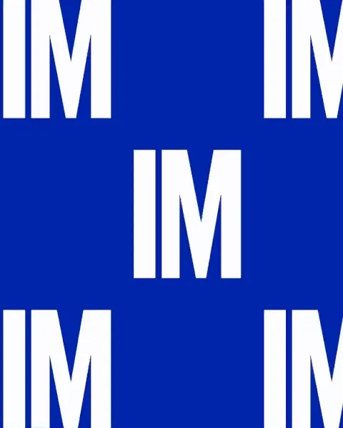
A bold white IM monogram set in a heavy sans tiles edge to edge across a royal-blue field, forming a high-contrast repeating brand pattern.
Summary
A brand-pattern tile built from a single "IM" monogram in bold uppercase sans, repeated in white across a saturated royal-blue ground so the letters themselves become the texture.
Visual description
Large white "IM" pairs are laid on a regular grid, one centered and four cropped at the corners so the unit clearly tiles seamlessly. The letterforms are heavy and squared with thick even strokes, and the wide gap between the I and M lets the blue field show through as deliberate negative space. The color is a single deep royal blue with no gradient or shadow. The crops at the edges signal the pattern continues, giving a wrapping-paper or surface-repeat feel rather than a finished composition.
Key takeaway
Using a two-letter monogram as the repeat unit turns the logo itself into a brand pattern, no decorative motif needed. Heavy letter weight plus generous internal spacing keeps the tile legible as letters while still reading as texture from a distance.
Reuse notes
Ideal as a secondary brand surface, packaging wrap, tote, or slide background once a primary monogram exists. Pick a single high-saturation ground and white type for maximum carry. Keep the repeat loose enough to read the letters, since tighter packing collapses it into stripes.
More like this



Keep what you find
A free account saves references to boards and can send you a weekly email of picks based on what you save.
To see every result, go Pro.