Preview image. Unlock full-res
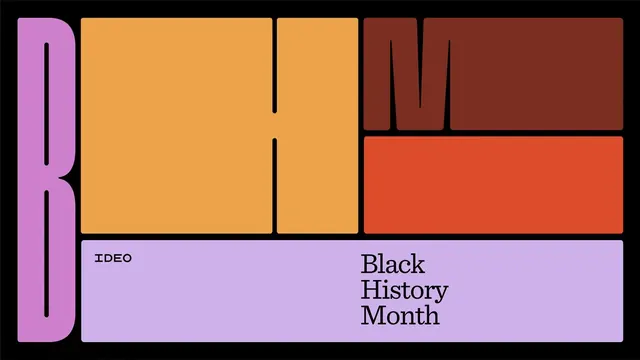
A horizontal banner spelling BHM as oversized color-blocked letterforms in lavender, amber, maroon, and coral, with IDEO and Black History Month set in a panel below.
Summary
A 16:9 campaign banner that builds the letters B, H, and M out of full-bleed color-blocked panels, turning a Black History Month title into a modular grid of saturated rectangles on black.
Visual description
The artwork is a wide rectangle on a pure black ground, divided into a tight grid of rounded-corner color panels separated by thin black gutters. On the left, a tall lavender column carries a black B drawn as a cut-out negative shape. The center is a large amber field holding a chunky H, also rendered as black negative space between blocks. The top-right splits into a deep maroon panel forming an M and a coral panel below it. A wide lavender bar runs along the bottom, set with a small monospace-style IDEO label at left and the words Black History Month stacked in three lines of a high-contrast serif at right. Letters are formed by the panels themselves rather than placed on top, so color, layout, and typography are one system.
Key takeaway
Construct headline letterforms from the layout grid itself, letting saturated color panels do double duty as both background and type. The mix of a small monoline brand mark against a stacked editorial serif inside one bottom bar gives a clean credit zone without breaking the block system.
Reuse notes
Great for cultural campaigns, awareness months, editorial series, or any identity that needs a flexible, recolorable modular system across many sizes. The block-as-letter approach scales to social tiles and motion. Caveat: legibility depends on the letters reading clearly as letters, so test each composition rather than assuming the grid spells itself out.