Preview image. Unlock full-res
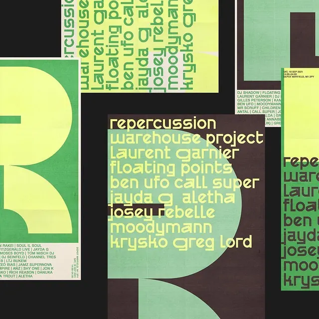
A dense experimental typographic poster layering overlapping text blocks in lime-green and beige over a bold curved mint-green shape and dark brown-black ground.
Summary
An experimental typographic poster for Repercussion Warehouse Project featuring overlapping sans-serif text in lime and beige layered over bold curved mint-green geometric shapes on a dark ground.
Visual description
A chaotic yet structured composition dominated by a large curved mint-green organic shape anchoring the left side. A bright yellow-lime rectangle fills the upper portion with overlapping text in green and pale yellow set at various angles and scales. The center and right feature dense blocks of overlapping sans-serif typography in lime, cream, and white naming artists and event details. A dark brown-black ground provides stark contrast. Small informational text blocks and event data are positioned in the negative space. The overall texture is intentionally complex and layered, with no clear entry point but a clear hierarchy emerging through color and scale.
Key takeaway
The balance of chaos and order through color: the three hues (lime, mint, dark brown) create visual coherence despite the complexity. Overlapping text at different scales and rotations generates energy without completely sacrificing readability. The large organic curved shape provides a visual anchor that prevents the composition from feeling scattered. Cream and white text over dark ground ensure contrast for critical information despite the noise.
Reuse notes
Excellent for music, arts, and cultural event promotion where experimental energy is desired. Works best when the audience expects boldness and isn't scanning casually. Pair with simpler secondary materials (website, ticket stub) to avoid overwhelming. The lime and mint combination reads youthful and anti-establishment; reconsider for conservative brands. Requires careful type selection to ensure body text remains scannable despite the layered treatment.
More like this

Keep what you find
A free account saves references to boards and can send you a weekly email of picks based on what you save.
To see every result, go Pro.