Preview image. Unlock full-res
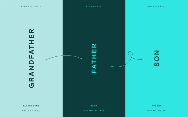
A brand color palette sheet splitting mint, deep forest, and bright teal into three full-height columns labeled Grandfather, Father, and Son with RGB and CMYK values.
Summary
A brand color palette specification laid out as three full-height columns, each color named in a generational metaphor (Grandfather, Father, Son) and annotated with its RGB and CMYK breakdown.
Visual description
Three equal vertical panels fill the frame: pale mint on the left, deep forest green in the center, bright cyan-teal on the right. Each panel carries one rotated, vertically-stacked word in tracked-out all-caps sans-serif, reading bottom to top: GRANDFATHER, FATHER, SON. RGB triplets sit small along the top edge of each column, and a label plus CMYK string anchors the bottom (BACKGROUND, HERO, ACCENT). Two thin hand-drawn arrows curve left to right between the panels, linking grandfather to father and father to son, implying inheritance. The center column inverts the scheme, light type on dark, while the outer two run dark type on light.
Key takeaway
The generational naming of palette roles (Grandfather as background, Father as hero, Son as accent) is a memorable way to communicate hierarchy instead of plain swatch labels. The thin script arrows knitting the columns together turn a static spec sheet into a narrative of lineage.
Reuse notes
A strong template for a brand guidelines color page or a portfolio case study divider. The rotated column names and corner-anchored RGB/CMYK data scale cleanly to any three-to-four color system. Best when each color genuinely maps to a functional role worth naming.
More like this






Keep what you find
A free account saves references to boards and can send you a weekly email of picks based on what you save.
To see every result, go Pro.