Preview image. Unlock full-res
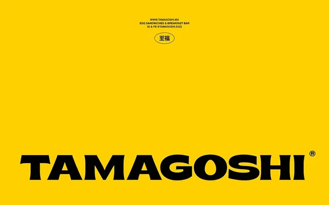
Bold black typography on a warm golden yellow field, anchored by a compact Chinese-character logo mark above contact details.
Summary
A wordmark for a food service brand using bold black sans-serif type set on a warm golden yellow field, with a small red-outlined symbol and website/social contact info above.
Visual description
Bright golden yellow background filling the entire composition. Near the top, centered text reads "www.tamagoshi.mx", "egg sandwiches & breakfast bar", and "ig & fb @tamagoshi.egg" in black sans-serif. Below that sits a small red-outlined circular mark containing a white Chinese character. The bottom two-thirds of the composition features an oversized black sans-serif wordmark reading "TAMAGOSHI" with a registered trademark symbol, rendered in an extra-condensed, heavy weight that dominates the lower half. The layout uses justified, geometric spacing and minimal ornament.
Key takeaway
The extreme color contrast and weight hierarchy make this instantly readable from any distance. The red accent circle provides visual interest without breaking the minimal palette. The stacked information hierarchy (website, mark, wordmark) is confident and uncluttered, showing how a bold single-color background can support both branding mark and contact information simultaneously.
Reuse notes
Effective for food and beverage brands, small restaurants, or any service business that needs memorable clarity in signage or print. Works best on bright, warm backgrounds paired with heavy black type. The yellow-on-black reversal in print would be equally striking.