Preview image. Unlock full-res
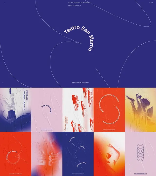
A theatre identity pairing an indigo cover with a flowing single-line drawing and curved 'Teatro San Martin' lettering, over a grid of poster tiles using duotone dancer photography.
Summary
A student identity project for Teatro General San Martin (2019), built on a curved "Teatro San Martin" wordmark that traces a continuous thin line, applied across a ten-tile grid of indigo, orange, pink, and yellow posters with duotone dancer photography.
Visual description
The top half is a deep indigo cover: a single hairline curve loops freely across the field, and the words "Teatro San Martin" bend along an arc following that line, set in a light italic. Small caps credits ("TEATRO GENERAL SAN MARTIN / IDENTITY PROJECT", "2019", "SOFIA MASTROGIACOMO") anchor the corners. Below sits a 5-by-2 grid of poster applications cycling through a tight palette of indigo, burnt orange, soft pink, and warm yellow. Each tile carries duotone photographs of dancers mid-motion, blurred and high-contrast, over which Spanish copy ("el cuerpo construye narrativas", "los sonidos propios del movimiento") and the curved wordmark are arranged on paths. Subtle paper-crease texture runs through every tile, and a faint line-drawn ellipse motif recurs.
Key takeaway
Set the wordmark on a curved path that literally follows a free-flowing line motif, then reuse that same line as the connective thread across every poster in the system. Hold a tight four-color palette and one duotone photo treatment so a varied grid of applications still reads as one identity.
Reuse notes
A reference for performing-arts, dance, festival, or cultural-institution branding where movement and a poster series matter. Type-on-a-path needs careful kerning and a real reason (here, the motion theme); the duotone-over-blur photo move depends on energetic source imagery to feel alive.
More like this



Keep what you find
A free account saves references to boards and can send you a weekly email of picks based on what you save.
To see every result, go Pro.