Preview image. Unlock full-res
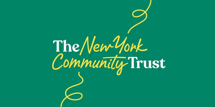
Logotype for The New York Community Trust mixing a white serif with a yellow looping script over a deep green field, with hand-drawn yellow flourishes in the corners.
Summary
A two-color logotype for The New York Community Trust that interleaves a sturdy white serif ("The", "Trust") with a buoyant yellow handwritten script ("New York", "Community") on a deep green field. The serif-against-script contrast carrying the whole identity is the defining move.
Visual description
Set on a flat emerald-green background, the name spans two lines at a slight upward tilt. "The" and "Trust" are in a confident white serif with bracketed slab-ish terminals, while "New York" and "Community" run through them in a looping mustard-yellow script, the words physically overlapping so the two typefaces interlock. Loose yellow line flourishes spiral off into the top-right and bottom-left corners like trailing pen strokes, echoing the script weight and adding hand-drawn movement to the otherwise stable lockup.
Key takeaway
Splitting a long organization name across two contrasting type voices (institutional serif plus warm script) lets the brand read as both established and human in a single lockup. Letting the two faces overlap rather than sit on tidy baselines makes the words feel woven together. The detached corner flourishes extend the script energy into the surrounding space without adding more words.
Reuse notes
Ideal for a nonprofit, foundation, community, or civic brand that needs to feel trustworthy yet warm and personable. The two-color green-and-yellow pairing is high-contrast and legible; on a busy photo background the white serif would need a scrim. Keep the script reserved for the human-sounding words and the serif for the formal ones to preserve the meaning of the contrast.
More like this




Keep what you find
A free account saves references to boards and can send you a weekly email of picks based on what you save.
To see every result, go Pro.