Preview image. Unlock full-res
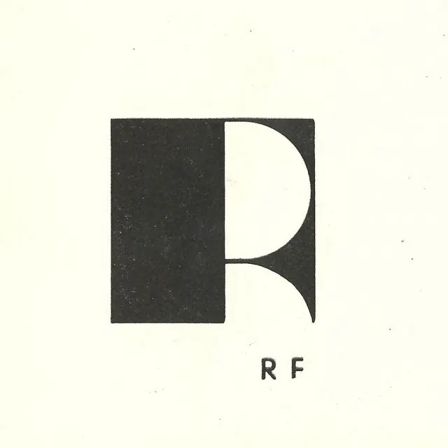
Vintage RF monogram that builds the letter R inside a solid black square using a half-circle and quarter-circle of negative space, with 'R F' lettered below.
Summary
A monogram that carves the letter R out of a solid black square purely with negative space, a half-circle bowl and a curved leg cut from cream, with "R F" set small in caps beneath.
Visual description
A filled charcoal-black square sits centered on a cream paper ground with a slightly mottled, printed-on-paper texture and a few stray flecks. The right edge of the square is hollowed out: a large white half-circle reads as the bowl of an R, and a thin curved sliver beneath it becomes the diagonal leg, so the whole letter emerges from voids rather than strokes. Below the mark, a small sans-serif "R F" in caps is spaced wide, acting as a quiet caption that confirms the initials.
Key takeaway
Constructing a letter entirely from circular cutouts in a solid shape, so the mark works as both a geometric block and a legible R depending on how you read figure and ground. The wide-tracked caption underneath disambiguates the letterform without crowding it.
Reuse notes
A strong reference for an initials-based identity for a studio, architect, or heritage brand that wants understatement. The cream-and-black, slightly inky rendering reads vintage or letterpress; recolor or sharpen it if you want a more contemporary feel. Best kept monochrome so the negative-space trick stays legible.