Preview image. Unlock full-res
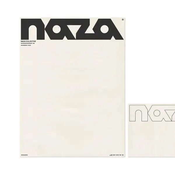
A bold 1970s-style 'NAZA' wordmark with chunky angular letterforms anchors the top-left of a near-empty cream poster, paired with an outlined version on a swatch beside it.
Summary
A heavy retro "NAZA" wordmark with chunky angular cuts and a small registered-trademark mark sits top-left on a tall cream sheet that is otherwise left almost entirely empty, presented next to an outline-only version on a paired swatch.
Visual description
The composition is a mockup pairing: a portrait cream poster on the left and a smaller square crop on the right showing the same mark as a thin outline. The wordmark is all-caps in a custom 70s-flavored display face, the A and Z built from sharp diagonal shears and pointed apexes, set solid charcoal on the warm off-white stock. Directly under it a tiny "NAZA COLLECTIVE" line and rows of dot-and-dash tracking marks act as system detailing. The vast lower expanse of paper is deliberately blank, with matching dot marks pinned to the bottom corners, so the eye holds on the logo.
Key takeaway
Let a single bold display wordmark own the top-left corner and leave 80 percent of the page empty, using tiny dot-and-dash tracking marks and a micro tagline as the only supporting detail. Showing the mark both filled and as an outline on an adjacent swatch communicates a logo system in one frame.
Reuse notes
Reaches for a fashion label, record collective, or studio wanting confident retro-modern identity energy. The warm paper texture and registered mark sell craft; on pure white or screen UI the same wordmark will feel colder, so keep the off-white ground if you can.
More like this





Keep what you find
A free account saves references to boards and can send you a weekly email of picks based on what you save.
To see every result, go Pro.