Preview image. Unlock full-res
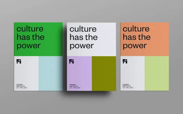
Three Finnish Institute posters reading 'culture has the power,' each recoloring the same quartered grid in a different palette to show a flexible identity system.
Summary
A trio of A-format posters for the Finnish Institute UK + Ireland, each repeating the headline "culture has the power" over the same four-panel grid but swapped to a new color scheme to demonstrate a recolorable identity system.
Visual description
Three identical poster layouts lie side by side on a flat grey surface. Each is split into four blocks: the top-left quadrant carries a three-line lowercase headline in a bold sans-serif, the top-right and lower quadrants are solid color fields. A small "Fi" monogram sits at the lower-left, with a three-line "FINNISH INSTITUTE UK + IRELAND" label beneath it in tiny caps. The leftmost poster pairs grass green with pale aqua; the center pairs off-white and lilac with an olive block; the right pairs cream with peach and a soft lime. The grid, type placement, and copy stay fixed while only the color assignments rotate.
Key takeaway
The whole point is the system: lock a rigid quartered grid and one headline, then prove range by recoloring the blocks. The lowercase bold headline reading as calm rather than shouty despite its size. A tiny monogram plus stacked institutional label as a consistent foot signature.
Reuse notes
Ideal reference for a cultural or institutional brand that needs many on-brand variants from a single template (event posters, social tiles, covers). The fixed-grid, swap-the-palette method scales to dozens of pieces while staying recognizable; pick palettes with similar value so no variant overpowers the set.
More like this


Keep what you find
A free account saves references to boards and can send you a weekly email of picks based on what you save.
To see every result, go Pro.