Preview image. Unlock full-res
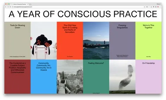
A 5x2 modular grid of colored tiles introducing workshop topics, structured in sans-serif typography with earthy, muted, and neon accents.
Summary
A structured 5x2 grid layout for a consciousness workshop, using color-blocked tiles and sans-serif type to organize thematic topics. Each tile pairs a distinct color with a topic header and descriptive caption.
Visual description
The layout divides a landscape format into a regular five-by-two grid of colored rectangular tiles, each containing text and occupying equal visual weight. The palette alternates between earthy, desaturated warm tones (beige, muted burgundy, soft blue, muted green) and accent pops of vibrant lime-green and bright red-orange. Typography is clean, sans-serif, hierarchical: bold topic headers contrast with lighter body text, all carefully positioned to ensure legibility within each tile. Tile subjects include "Tools for Slowing Down", "Commodify Consciousness in Holistic", "Community Art in Houston", "Feeling Welcome", and "On Friendship", each supporting a distinct visual identity while maintaining the overall modular integrity.
Key takeaway
The tile-based grid as a framework for organizing discrete topics at equal visual hierarchy. The restrained palette—earthy mutureds punctuated by exact accent colors—creates coherence without monotony. The systematic type treatment, with consistent scale and weight relationships, anchors legibility across all tiles.
Reuse notes
Ideal for workshop agendas, topic catalogs, educational curricula, or any modular content system requiring visual balance. Works well for nonprofits, academic settings, or introspective/wellness contexts. The rigid grid enforces structure but can feel cold if the content itself lacks personality; pair with more expressive imagery or type if warmth is needed.
More like this
Keep what you find
A free account saves references to boards and can send you a weekly email of picks based on what you save.
To see every result, go Pro.