Preview image. Unlock full-res
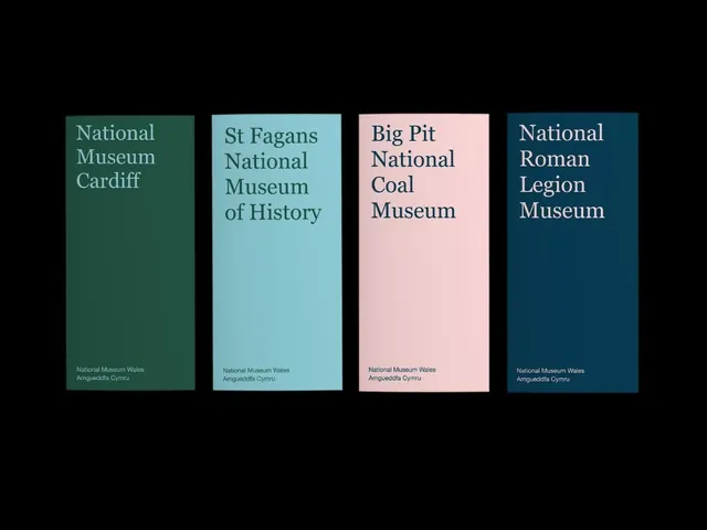
Four bilingual museum brochure covers, each a single saturated color panel with a top-set serif title and a small lockup, forming a tonal family across green, teal, pink and navy.
Summary
A four-cover brochure system for the National Museum Wales group, where each venue gets its own flat color panel but shares one layout: a multi-line serif title near the top and a small two-line bilingual lockup at the bottom. The color is the only variable, so the family reads as one identity at a glance.
Visual description
Four equal vertical panels float on a black ground, evenly spaced. Left to right they are deep forest green, soft aqua, blush pink, and dark navy. Each carries a venue name set ragged-left in a transitional serif near the top ("National Museum Cardiff", "St Fagans National Museum of History", "Big Pit National Coal Museum", "National Roman Legion Museum"), with the type tinted a tone of its own panel color rather than pure white. At the foot of every panel sits the same small two-line lockup, "National Museum Wales / Amgueddfa Cymru", giving the bilingual master brand. Generous empty space sits between title and footer.
Key takeaway
The whole system flexes on one axis only: change the panel color per sub-brand, keep everything else identical. Tinting the title to a shade of its own background (instead of white) keeps each cover quiet and tonal while still legible. The repeated bilingual footer lockup ties unrelated venues into a single museum family.
Reuse notes
A clean model for any parent brand with multiple sub-venues, locations, or product lines that each need an identity but must stay visibly related. Works for museums, universities, festivals, or municipal services. Pick colors that read as a considered palette together; the restraint of one serif and one footer lockup is what makes it feel institutional rather than busy.
More like this




Keep what you find
A free account saves references to boards and can send you a weekly email of picks based on what you save.
To see every result, go Pro.