Preview image. Unlock full-res
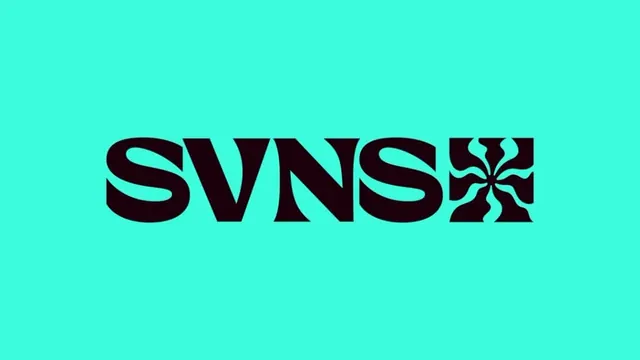
Heavy display wordmark reading SVNS in near-black, paired with a square tile holding a four-petal floral monogram, set on a bright aqua field.
Summary
A heavy all-caps wordmark spelling SVNS sits centered on a bright aqua background, capped on the right by a square icon tile carrying a symmetrical four-petal floral monogram cut from the same dark ink.
Visual description
The composition is a single horizontal lockup centered in the frame. The four letters are drawn in a fat, high-contrast display face with closed, rounded counters and curved spurs that give the S and N a slightly retro, almost art-nouveau softness rather than a hard grotesque feel. To the right of the final S, a solid square tile the same height as the cap line reverses the relationship: instead of dark letters on aqua, the dark tile holds an aqua negative-space mark of four interlocking petals radiating from a center, echoing a snowflake or pinwheel. The whole mark is two tones only, dark near-black ink on saturated mint-aqua, with generous empty margin all around.
Key takeaway
The square monogram tile acting as a terminal "letter" in the wordmark, so the icon can detach and stand alone as an app mark or badge while still reading as part of the logotype. Also the trick of cutting the icon as negative space inside a solid block, which inverts the figure-ground and adds a second texture without a third color.
Reuse notes
Strong for event, sports, or lifestyle brands that want energy from a single loud color pairing. The detachable tile gives you a ready-made favicon and avatar. Works best where the aqua can stay fully saturated; on print or low-gamut screens the contrast and vibrancy both suffer.