Preview image. Unlock full-res
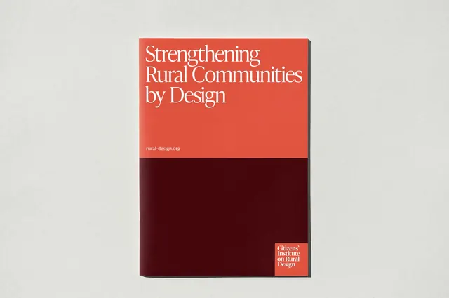
A booklet cover split into a coral upper band and a deep-maroon lower block, with a large white serif title and a small logo lockup tucked into the bottom corner.
Summary
A printed booklet cover photographed flat on grey paper, split horizontally into a coral top band and a deep oxblood-maroon bottom block. The single defining move is the high serif title set entirely in the coral zone while the maroon half stays empty.
Visual description
The cover divides at roughly its midpoint: a warm coral-orange band fills the top, a near-black maroon block fills the bottom. A four-line white title in a high-contrast serif (ditone strokes, elegant terminals) reads "Strengthening Rural Communities by Design," left-aligned and pushed to the top-left. A small white URL line, "rural-design.org," sits low in the coral band. Bottom-right, a tiny coral rectangle holds a stacked white sans-serif logo lockup reading "Citizens' Institute on Rural Design." The whole booklet casts a soft drop shadow on the textured off-white surface.
Key takeaway
The horizontal color split that gives the title a coral "stage" and leaves the maroon half as deliberate negative space. The corner logo chip, a small coral rectangle echoing the top band, ties the lockup back to the palette without a heavy footer.
Reuse notes
Strong template for report, program, or institutional booklet covers where one warm accent plus one dark grounding color must feel serious but not cold. The empty lower block invites a spot image or embossing on a real print run. Works because the serif carries warmth; swapping in a geometric sans would flatten it.
More like this


Keep what you find
A free account saves references to boards and can send you a weekly email of picks based on what you save.
To see every result, go Pro.