Preview image. Unlock full-res
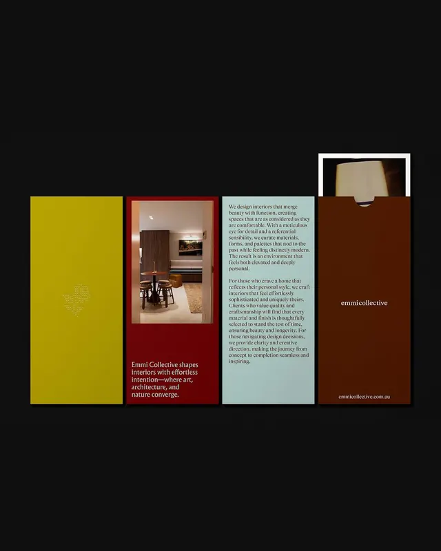
Four-panel branding system for Emmi Collective using warm, earthy tones (mustard, terracotta, sage, cream) with integrated photography and body copy.
Summary
Four-panel branding system for Emmi Collective using warm, earthy tones (mustard, terracotta, sage, cream) with integrated photography and body copy.
Visual description
A four-column layout on a dark background. From left to right: a solid mustard-yellow panel with a subtle embossed texture or watermark. A terracotta-red panel framing an interior photograph of a dining space with warm lighting and wood elements. A sage-green panel containing two blocks of body text in black, discussing interior design philosophy and the studio's approach to residential and commercial spaces. A warm brown panel on the far right displaying the studio name "emmicollective" in white sans-serif type. Photography shows natural materials and warm color tones consistent with the branding palette. Typography is clean, contemporary sans-serif; generous leading and margins emphasize spaciousness and editorial sophistication.
Key takeaway
The analogous color harmony (mustard, terracotta, sage, brown) creates warmth and cohesion without feeling garish. The mix of solid color, photography, and substantial body text balances visual rhythm and content density. The restrained palette and clean typography convey both craft and professionalism, suit able for luxury interior and design practices.
Reuse notes
Ideal for architecture, interior design, or lifestyle-focused branding. Works well in portfolio pieces, lookbooks, or studio websites where mood and materiality matter. The warm earthy palette signals heritage, craft, and approachability. The body-copy treatment suits long-form statements of studio philosophy. Avoid using with cool palettes or high-saturation colors that would clash.
More like this





Keep what you find
A free account saves references to boards and can send you a weekly email of picks based on what you save.
To see every result, go Pro.