Preview image. Unlock full-res
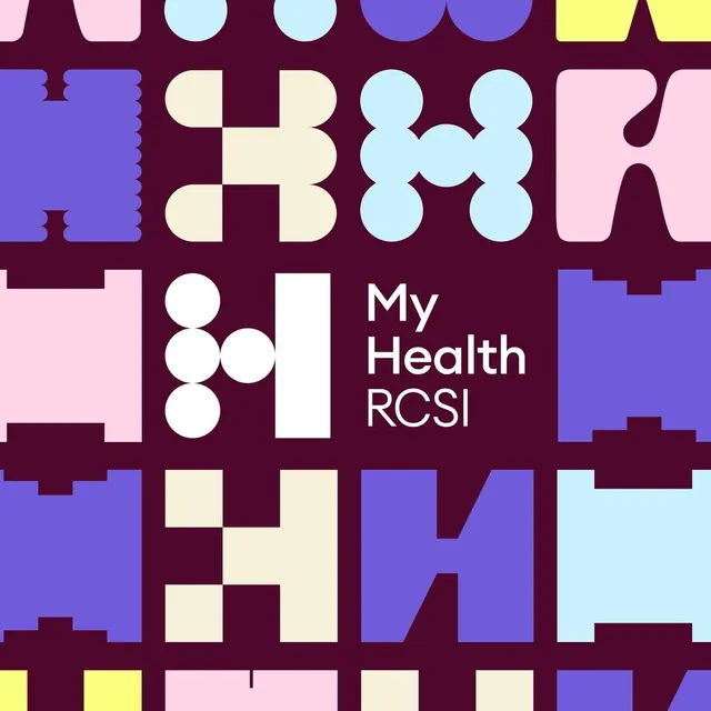
A My Health RCSI identity where one modular H letterform built from circles and bars repeats at different scales and pastel colors across a maroon grid, with a crisp white version as the lockup.
Summary
A modular identity for My Health RCSI where one H glyph assembled from circles and a vertical bar repeats at different scales and pastel colors across a tile grid, with a clean white version acting as the formal lockup.
Visual description
A deep maroon field is divided into a loose grid of square tiles. Each tile holds a variant of the same H letterform constructed from geometric primitives: stacked circles, rounded half-circle bumps, and a straight stem, rendered in periwinkle purple, pale pink, light blue, cream, and pale yellow. The shapes vary in weight and arrangement tile to tile so the pattern stays visually fresh while reading as one system. Near the center-left, a crisp white H (three white dots beside a solid bar) sits next to the wordmark "My Health RCSI" in clean white sans-serif; this pairing is the formal logo. The pastels stay soft against the saturated maroon, creating a friendly yet high-contrast effect.
Key takeaway
Designing one monogram from a small kit of geometric primitives (circle, half-circle, bar) and remixing it into an endless decorative pattern generates a logo and a brand texture from a single idea. Holding the wordmark in plain white while the colored tiles play around it keeps the identity legible without abandoning the playful system.
Reuse notes
Ideal for healthcare, education, or institutional brands that want approachability without looking childish; the maroon base keeps it credible while the pastels warm it up. The pattern needs enough tiles to read as a system, so it suits covers, social tiles, and large surfaces more than tight spaces. Lock in the primitive set early so every future glyph stays on-system.
More like this

Keep what you find
A free account saves references to boards and can send you a weekly email of picks based on what you save.
To see every result, go Pro.