Preview image. Unlock full-res
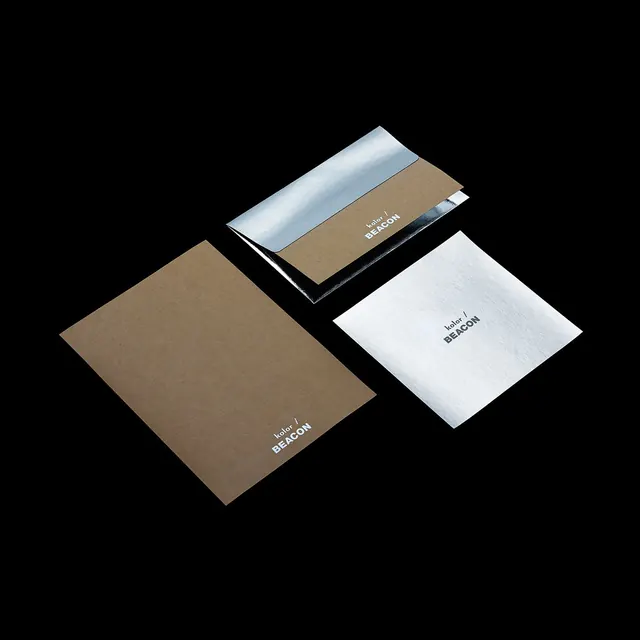
Stationery branding mockup pairing a matte kraft envelope, a silver foil-lined envelope, and a mirror-foil card on black, each stamped with a small kolor / BEACON wordmark.
Summary
A stationery flat-lay where the whole identity rides on material contrast: matte kraft paper against high-shine silver foil, all floating on pure black with a tiny two-line wordmark as the only print.
Visual description
Three pieces sit on a black background lit to drop soft shadows. Lower left, a brown kraft envelope lies flat. Top center, a second envelope with the flap open reveals a mirror-silver foil lining, the foil catching a hard reflection. Lower right, a square card in the same reflective silver. Each piece carries the same small mark, "kolor /" in a thin weight above "BEACON" in heavier caps, foil-stamped so it reads near-tonal on the silver and pale on the kraft. The objects are angled in loose diagonal alignment, generous black space between them.
Key takeaway
Build an identity out of substrate alone: one matte stock plus one mirror-foil stock, the same tiny mark on both, nothing else. The black ground turns the foil into the loudest element without adding a single color. Keeping the logo small lets the materials carry the brand.
Reuse notes
Reach for this when presenting a premium or fashion-adjacent identity where tactility sells the work. Works for stationery, packaging, and invite systems. Needs real foil and good photography to land; the effect collapses if the foil is faked flat or the lighting is even.
More like this

Keep what you find
A free account saves references to boards and can send you a weekly email of picks based on what you save.
To see every result, go Pro.