Preview image. Unlock full-res
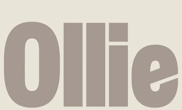
An oversized lowercase Ollie wordmark set in a heavy condensed grotesque, rendered in warm taupe on a cream ground and cropped so the letters bleed off the frame.
Summary
An oversized lowercase "Ollie" logotype in a heavy condensed grotesque, set in warm taupe on a cream background and cropped tight so the round o and e bleed past the edges of the frame.
Visual description
The word fills the entire canvas: thick, condensed lowercase letters in a soft greyish-taupe sitting on a warm off-white ground, a low-contrast tonal pairing rather than the usual black-on-white. The forms are heavy and rounded, with the bowl of the o and the closing e running off the top and bottom edges so the type is intentionally cropped. The two l's are flat-topped vertical bars; the i carries a square-ish dot. The single-color, single-word treatment leans entirely on weight, scale, and the cropping to create presence.
Key takeaway
The tonal color move: setting a heavy wordmark in a muted mid-tone on a closely related cream instead of high-contrast black makes it read soft and premium while still holding shape. Combined with cropping the letters off the frame, it turns a plain logotype into a confident, editorial brand image.
Reuse notes
A strong direction for a lifestyle, beauty, food, or hospitality brand wanting warmth rather than tech crispness. The low contrast is the point but watch accessibility, this works as a hero or packaging treatment, not as small body or UI type. Pairs well with airy layouts and natural photography.
More like this


Keep what you find
A free account saves references to boards and can send you a weekly email of picks based on what you save.
To see every result, go Pro.