Preview image. Unlock full-res
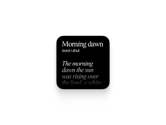
A black rounded-square card floating on white, with a bright serif heading 'Morning dawn' over an italic serif poem that fades to black at the lower edge.
Summary
A single black rounded-square card centered on a white ground, holding a short typographic passage: the serif heading "Morning dawn", a small sans subhead "korol i shut", then an italic serif stanza that fades out into black before the last line completes.
Visual description
The card is a generous-radius black square with a soft drop shadow, sitting in lots of white margin like an app widget or sticker. Type is left-aligned inside it. "Morning dawn" is set in a high-contrast serif with a faint silver sheen, almost foil. Below it a small grey sans line reads "korol i shut". A gap, then the body in italic serif begins crisp and white at "The morning dawn the sun was rising over" and dissolves to near-invisible grey on the bottom edge, the text literally bleeding into the card. Strictly black, white, and grey.
Key takeaway
The fade-to-black text mask: letting body copy melt into the card edge instead of cutting it cleanly gives a moody, unfinished, poetic feel and implies more text without showing it. The foil-sheen serif heading against matte black reads premium. Pairing a refined serif heading with a tiny plain-sans label is a clean two-voice hierarchy.
Reuse notes
Reach for this on quote cards, lyric or poetry tiles, editorial pull-quotes, or a moody music or fashion brand snippet. Works as a repeatable widget format in a feed. Caveat: the fade sacrifices legibility on purpose, so never use it where the full sentence must be read.
More like this






Keep what you find
A free account saves references to boards and can send you a weekly email of picks based on what you save.
To see every result, go Pro.