Preview image. Unlock full-res
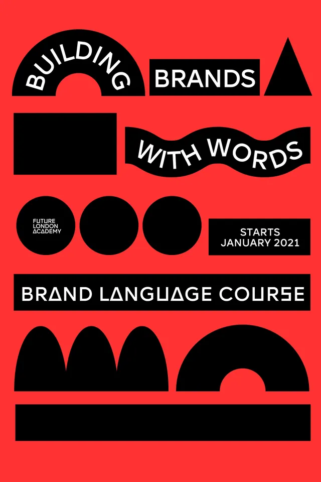
A bold red poster uses black geometric shapes and white typography to promote a brand language course.
Summary
A bold red poster uses black geometric shapes and white typography to promote a brand language course.
Visual description
The image shows a tall poster on a vivid red background with multiple black geometric forms arranged in stacked bands. White text appears inside and across the shapes, including curved lettering, a wavy word line, and a large all-caps course title near the middle-lower area. The bottom has a large black horizontal bar and several oversized abstract black shapes.
Key takeaway
Use a strict two-color palette with oversized geometric forms to create a strong identity system. Let typography interact with shapes in unusual ways, such as curved, arched, or wavy text, to make a simple layout feel designed.
Reuse notes
This works well for course promos, brand campaigns, or editorial posters that need immediate visual impact. Reach for it when the goal is to make type and shape feel like one unified graphic language rather than separate elements.