Preview image. Unlock full-res
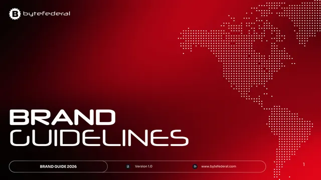
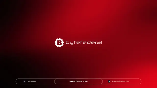
Red-gradient cover with an oversized two-line "Brand Guidelines" title, the gear-B wordmark top-left, and a dotted Americas map.
Summary
The title slide: a saturated red-to-black gradient field carrying an oversized white "BRAND / GUIDELINES" headline and a dotted-map graphic, establishing the deck's bold fintech tone.
Visual description
A wide red gradient that deepens to black at the lower left. Top left sits the gear-B icon and lowercase "bytefederal" wordmark in white. The right half is filled with a dotted-pixel map of the Americas in white. The lower left carries a two-line headline, "BRAND" over "GUIDELINES," in a large white futuristic display face. A thin rounded pill bar spans the bottom with three segments: "BRAND GUIDE 2026," a document icon plus "Version 1.0," and a globe icon plus "www.bytefederal.com." A small "1" page number sits at the far right.
Key takeaway
The oversized two-line display headline set low-left against a single dominant brand color reads instantly as a cover. The dotted-map graphic doubles as decoration and a "global reach" cue without competing with the title. The segmented pill bar is a tidy way to pack version, brand, and URL metadata into one footer.
Reuse notes
A clean template for a bold, single-color guideline or report cover, especially for fintech or crypto brands with a network or global story. The dotted-map device suits any company implying worldwide coverage. Works best when the brand color is saturated enough to carry a full-bleed gradient.
From this deck: Byte Federal cover - Brand Guidelines 2026
View deck







More like this







Keep what you find
A free account saves references to boards and can send you a weekly email of picks based on what you save.
To see every result, go Pro.