Preview image. Unlock full-res
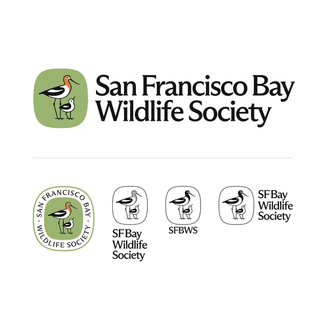
A logo lockup system for the San Francisco Bay Wildlife Society pairing an avocet-and-chick illustration in a sage rounded square with a classic serif wordmark across primary, badge and mono variants.
Summary
A complete logo lockup family for the San Francisco Bay Wildlife Society, built around an illustrated avocet and its chick inside a soft sage rounded square, set next to a warm serif wordmark. The sheet lays out the primary lockup plus badge and short-form variants.
Visual description
Top of the sheet shows the primary horizontal lockup: a sage-green rounded-square icon holding a hand-drawn American avocet with a rust-orange head and a small grey chick, beside two stacked lines of "San Francisco Bay Wildlife Society" in a humanist serif. A thin rule separates this from a row of four secondary marks below. Left to right: a circular seal version with the type curved around the green badge, a black-and-white icon-only variant with a grey-headed adult, a fully monochrome icon, and a compact "SF Bay Wildlife Society" lockup. The illustration style is flat with confident black linework; the palette stays muted sage, rust, grey and white throughout.
Key takeaway
Designing the bird as a parent-and-chick pair builds the organization's mission into the mark itself. The single icon is then proven across full color, two-tone, mono, sealed and short-name forms, a responsive-logo kit that holds up from letterhead to a favicon without redrawing the art.
Reuse notes
A template worth borrowing for any conservation, parks, or community nonprofit that wants warmth over corporate polish. The serif wordmark plus illustrated-animal badge reads approachable and credible at once. Present the variant grid like this in a brand guide so downstream users pick the right lockup for the size and background.
More like this


Keep what you find
A free account saves references to boards and can send you a weekly email of picks based on what you save.
To see every result, go Pro.