Preview image. Unlock full-res
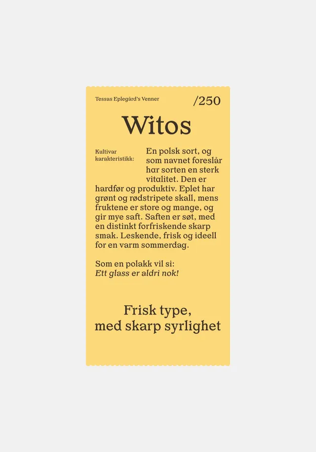
Vertical scalloped-edge product label in mustard yellow with a serif Witos headline, a numbered /250 edition mark, and a column of Norwegian descriptive copy.
Summary
A tall mustard-yellow product label, shaped like a ticket with scalloped top and bottom edges, headlined by a large serif "Witos" and a "/250" edition number, carrying a block of Norwegian tasting copy.
Visual description
The label is centered on a pale gray field, a vertical rectangle in warm mustard yellow with finely scalloped (perforated-ticket) top and bottom edges. At the top, a small caps-set line "Tessas Eplegård's Venner" sits left, balanced by a bold "/250" edition mark right. Below, "Witos" is set very large in a high-contrast serif. A "Kultivar karakteristikk:" label introduces a justified column of running serif body copy, with the first lines indented around the label. Near the base, an italic line and then a two-line bold serif strapline "Frisk type, med skarp syrlighet" close it out. Everything is near-black ink on yellow, a single-color, type-only system relying on scale and weight for hierarchy.
Key takeaway
The ticket/coupon silhouette: scalloped die-cut edges instantly signal an apple-orchard, raffle, or heritage-product feel without any illustration. Hierarchy is built purely from one serif at three sizes plus an oversized edition number, proving a label can be entirely typographic. The justified copy block wrapping a small side label is a tidy editorial detail.
Reuse notes
Reach for this on craft-food, cider, preserve, or limited-edition packaging where warmth and a hand-numbered, small-batch feel matter. The single-color-on-yellow approach is cheap to print and screen-friendly. Pairs well with kraft or uncoated stock. Caveat: dense justified body copy at this size works on a held product but would be hard to read at thumbnail scale.
More like this



Keep what you find
A free account saves references to boards and can send you a weekly email of picks based on what you save.
To see every result, go Pro.