Preview image. Unlock full-res
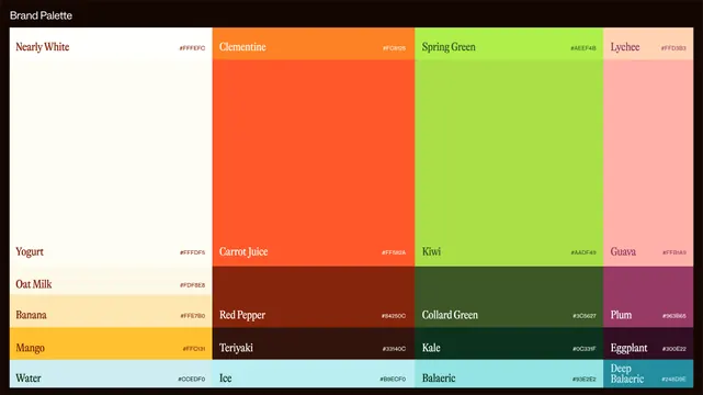
A named color palette grid showing 16 swatches arranged in rows, spanning pastels to vibrant tones with hex values, suitable for food, beverage, or wellness branding.
Summary
A systematically organized color palette with 16 named swatches spanning warm to cool tones, each labeled and paired with its hex value, designed for food, beverage, or wellness brand systems.
Visual description
A black header bar at the top reads "Brand Palette" in white sans-serif. Below, 16 color swatches occupy a rectangular grid, arranged in three columns and five rows. Each swatch displays its color name in white or dark text (depending on swatch darkness) and its hex code in the upper-right corner. The palette includes: Nearly White (#FFFEF0), Clementine (#FFC655), Spring Green (#AEEF48), and Lychee (#FFD383) across the top row; Yogurt, Carrot Juice, Kiwi, and Guava following; then Oat Milk, Red Pepper, Collard Green, and Plum in the third row; and Banana, Teriyaki, Kale, and Eggplant below. The final row shows Water, Ice, Balaeric, and Deep Balaeric. The colors evoke food and natural ingredients while spanning warm oranges and yellows through fresh greens and cool blues and teals.
Key takeaway
A legible, grid-based color system with semantic naming tied to ingredients or foods, making the palette intuitive to apply and communicate across teams. The color progression from warm through cool tones creates harmony while maintaining enough contrast for functional use in UI or print. Hex values included for development handoff.
Reuse notes
Use as a reference for food, nutrition, wellness, or beverage brands needing a cohesive, ingredient-inspired palette. The natural naming convention (Clementine, Carrot Juice, Kale) is memorable and helps non-designers apply colors correctly. Suitable for menu design, app interfaces, packaging, or brand guidelines.
More like this


Keep what you find
A free account saves references to boards and can send you a weekly email of picks based on what you save.
To see every result, go Pro.