Preview image. Unlock full-res
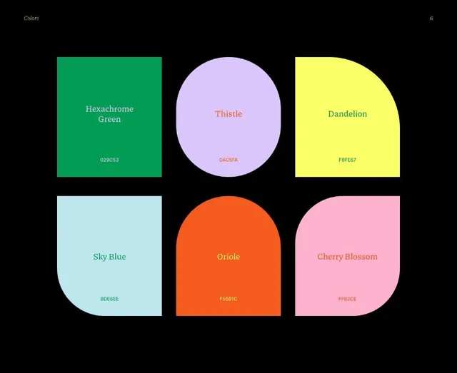
A brand guideline color page on black showing six named swatches (Hexachrome Green, Thistle, Dandelion, Sky Blue, Oriole, Cherry Blossom) each in a different rounded shape with serif label and hex code.
Summary
A brand color page laid out as a two-by-three grid of six swatches on black, where each color is given a distinct rounded shape, a serif name and its hex value.
Visual description
Black background with a small italic "Colors" label top-left and a page number "6" top-right. Six large color blocks sit in a two-row, three-column grid. Each takes a different rounded silhouette: a plain square (Hexachrome Green), a full ellipse (Thistle), a quarter-rounded panel (Dandelion), an organic blob (Sky Blue), an arch / tombstone (Oriole), and a leaf-cornered panel (Cherry Blossom). Inside each block, the color name sits centered in a tinted serif and the uppercase hex code (029C53, DAC5FA, FBFE67, BDE6EE, F55B1C, FFB2CE) sits below it. Type color is keyed off a neighbor swatch rather than plain white, so labels feel woven into the palette.
Key takeaway
Giving every swatch its own shape so a color page becomes a memorable shape system, not just a row of rectangles. Setting each label in a serif color borrowed from another swatch instead of default white, which models how the palette pairs with itself. Pinning the swatches on pure black to maximize the pastel-to-vibrant contrast.
Reuse notes
A polished pattern for the color section of a brand guideline or design-system doc, especially when you want the palette page to feel crafted rather than utilitarian. The named-color plus hex convention reads as a real identity system. The varied shapes are decorative, so on a strict system keep the swatches uniform and let only the labels vary.
More like this






Keep what you find
A free account saves references to boards and can send you a weekly email of picks based on what you save.
To see every result, go Pro.