Preview image. Unlock full-res
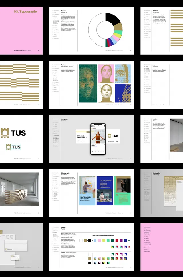
A comprehensive design system for TUS featuring a modular visual language combining geometric iconography, a bold color palette, and clean typographic hierarchy across applications.
Summary
A comprehensive design system for TUS featuring a modular visual language combining geometric iconography, a bold color palette, and clean typographic hierarchy across applications.
Visual description
A grid of nine pages displays the TUS identity system. Top row shows brand color swatches (magenta, teal, deep blue), and geometric mark variations. Middle sections reveal typography layouts, a pink-toned page featuring portrait photography applied to geometric shapes, and mobile app mockups showing integrated icon systems. Lower sections document icon sets in varying styles, detailed color palettes arranged in rows, and responsive layouts on white and black backgrounds. Throughout, a modern sans-serif typeface maintains visual cohesion, and the black-white-magenta palette anchors every application.
Key takeaway
A modular icon system that maintains geometric clarity across weights and contexts. The strategic use of magenta as a bright accent breaks up neutral black and white without feeling secondary. The grid-based presentation itself communicates that this is a scalable, extensible system rather than a static logo.
Reuse notes
Excellent reference for designing identity systems for tech companies or forward-thinking agencies. The icon modularity adapts well to digital products, applications, and cross-platform campaigns. Works at small sizes in UI and large formats in print collateral.
More like this
Keep what you find
A free account saves references to boards and can send you a weekly email of picks based on what you save.
To see every result, go Pro.