Preview image. Unlock full-res
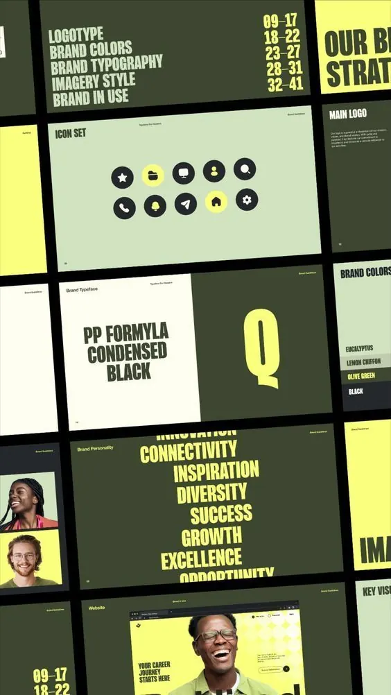
A brand guidelines spread showing a two-color system in olive green and bright yellow with icon set, typography samples, brand values, and photographic imagery in a modular grid-based layout.
Summary
A comprehensive brand guidelines presentation showing a two-color system (olive green and bright yellow) applied across icon sets, typographic specimens, color palettes, brand values, and photographic layouts in an organized modular grid.
Visual description
The image shows overlapping pages from a printed brand guideline document. The palette uses deep muted olive green and neon-bright yellow as primary colors, with cream, black, and white for neutrals. One page displays a grid of ten circular icons (star, chart, message, person, settings, phone, lightning, home, target, and gear) in black on a cream background. Another spread shows the typeface name "PP Formula Condensed Black" paired with an oversized yellow "Q" on olive background. A values page lists keywords like "Connectivity", "Inspiration", "Diversity", "Success", "Growth", "Excellence" in large yellow all-caps sans-serif. Personnel photography with candid headshots appears on several pages set against olive and yellow blocks, creating dynamic asymmetrical compositions. Page numbers and section labels are consistently positioned in a systematic layout system.
Key takeaway
The two-color contrast handling across diverse content types (icons, type, photography, data) with a clear modular grid keeping everything legible. The use of condensed all-caps sans-serif to convey modern corporate confidence without coldness. Yellow as a bright accent against olive gives the identity warmth and forward energy while staying professional.
Reuse notes
Strong reference for B2B or organizational identity systems that need to feel inclusive and contemporary. Works especially well for companies emphasizing people, growth, and structured communication. The icon set approach is reusable for service-based or tech-forward verticals.
More like this






Keep what you find
A free account saves references to boards and can send you a weekly email of picks based on what you save.
To see every result, go Pro.