Preview image. Unlock full-res
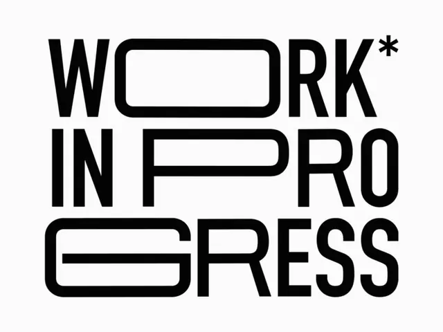
Bold, black sans-serif wordmark with geometric cutouts at baseline, set in a stacked three-line arrangement.
Summary
A bold black sans-serif wordmark reading "Work in Progress," with the letters stacked across three lines and distinctive rounded-rectangle cutouts bridging letter pairs.
Visual description
Three-line stacked composition on white. "WORK*" sits topmost, with a rounded horizontal rectangle cut through the center of the O. "IN" on the second line, each letter solid. "PROGRESS" at bottom, with a large rounded rectangle spanning below the baseline from P through O, creating a unified geometric shape. All letters are identical weight, black with clean rounded corners. Asterisk marks the end of "WORK". Generous line spacing emphasizes vertical rhythm; letterforms are wide and squat, with sans-serif geometry. Monochromatic black on white, no secondary colors.
Key takeaway
The cutout device: a negative-space rectangle used at baseline to unify otherwise disconnected letters (especially P, R, O, G) into a single visual gesture. This creates wordmark cohesion without a traditional closed letterform. The stacked arrangement and exaggerated letter width (square-ish proportion) reinforce playfulness within a minimal palette.
Reuse notes
Strong for tech, creative, or startup logotypes where "in progress" or iterative messaging is key. The heavy weight and rounded geometry make it readable at display sizes. Cutout works best where a rectangle aligns naturally; avoid asymmetric letter combinations. Works well in black-and-white or single-color contexts.
More like this




Keep what you find
A free account saves references to boards and can send you a weekly email of picks based on what you save.
To see every result, go Pro.