Preview image. Unlock full-res
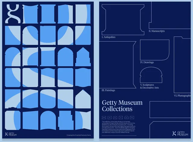
A modular identity system for the Getty Museum combining a 6x5 grid of rounded shapes in tonal blues with a schematic exhibition layout diagram and logotype, emphasizing curatorial organization and scholarly authority.
Summary
A two-panel museum identity system combining a modular grid of rounded rectangular shapes in graduated blues with a schematic floorplan diagram and logotype, establishing a scalable design system that communicates both curatorial organization and institutional credibility.
Visual description
The left panel displays a 6 by 5 grid of rounded rectangular shapes, each filled or outlined in varying tones ranging from deep navy (#0B1A54) to light cyan (#AFCEE8). The varying fill patterns and opacity levels create a rhythmic, almost musical quality, suggesting collection categories or exhibition zones. A small letter 'K' logotype appears in the bottom left corner. The right panel shows the Getty Museum Collections wordmark in a clean sans-serif at the bottom, anchored above by a minimal line-drawn schematic of museum exhibition rooms and galleries in white on the navy background. The schematic features rectangular and curved spaces labeled with collection categories (Manuscripts, Drawings, Paintings, Prints, Photographs, Sculptures, Decorative Arts).
Key takeaway
The modular grid of rounded shapes becomes a flexible, generative system that can be recombined or extended while maintaining visual cohesion. The use of tonal variation rather than distinct hues creates a sophisticated, calming palette appropriate to an institutional context. Pairing abstraction (the shape grid) with literal representation (the schematic floorplan) demonstrates how a single identity can communicate both curatorial method and spatial reality.
Reuse notes
Ideal for cultural institutions, archives, or research organizations that need to communicate structure and accessibility. The grid system scales well across applications: from a small mark to exhibition signage. The modular shapes invite interactive or responsive design applications. The cool blue palette evokes authority and thoughtfulness without coldness. Best suited to institutional, nonprofit, or educational sectors rather than commercial brands.