Preview image. Unlock full-res
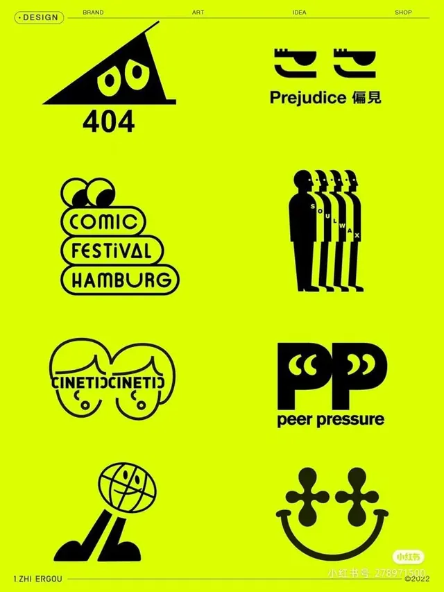
Neon lime-green poster presenting a design studio brand with a bold triangular mascot character and modular grid of six black line-art concept icons below.
Summary
A studio brand poster pairing a bold triangular mascot character with yellow eyes against a lime-green background, with a modular grid of six iconographic line-art marks below it.
Visual description
Neon lime-green field anchors the composition. Top left, a narrow wordmark "- DESIGN" in black sans-serif caps. Center left, a stark black triangle with two large yellow circular eyes and a slight forward tilt, reading as a friendly but geometric mascot. Below that, six black line-art icons arranged in a loose two-column grid: abstract geometric marks and symbolic forms representing concepts (communication, progression, presence, collaboration, connection, diversity). Each icon uses only black outlines, relying on negative space to define the forms. No typography accompanies the icons; the grid speaks through visual language alone.
Key takeaway
The economy of a two-element brand poster: a single mascot character doing all the personality work, paired with a silent icon grid that demonstrates the studio's conceptual vocabulary. The sustained two-color (black + neon) system creates maximum contrast and energy at small scale. The mascot's slight asymmetry (tilted triangle, off-center eyes) keeps it memorable while staying modular.
Reuse notes
Strong template for an agency or design studio brand presentation or lookbook cover. The lime-green + black reads bold at thumbnail but can feel dated if overused; pair this approach with a secondary palette for balanced application. The icon grid works best when each mark is genuinely distinct and relevant to the studio's core services.
More like this


Keep what you find
A free account saves references to boards and can send you a weekly email of picks based on what you save.
To see every result, go Pro.