Preview image. Unlock full-res
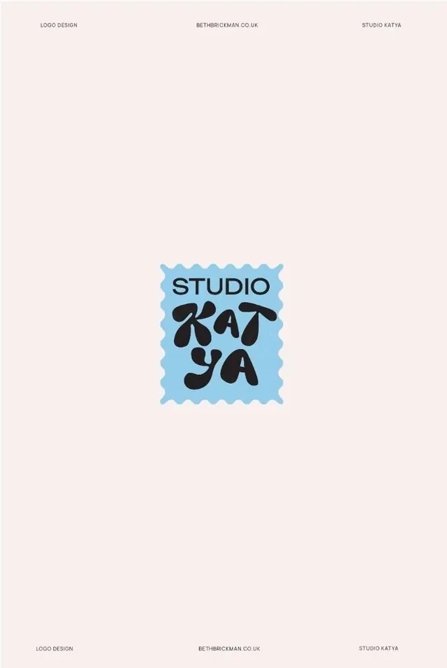
Art direction mark for a design studio using a wavy-bordered square badge with black handwritten letterforms centered on soft blue.
Summary
A rounded-square stamp badge containing "STUDIO KATYA" in stacked handwritten letterforms, set on a sky-blue background with a scalloped, wavy perimeter.
Visual description
Centered composition on a pale cream background. The logo occupies the middle two-thirds of the frame: a soft blue badge with rounded-square geometry and a wavy, picket-fence-like border all around. Inside, "STUDIO" is set small and uppercase in a tight sans-serif (gray or muted charcoal) on the top third, while "KATYA" in large, flowing handwritten script dominates the lower two-thirds in the same dark tone. The letterforms are loose and organic, with natural stroke variation. Supporting text labels "LOGO DESIGN", "BETH@BRICKMAN.CO.UK", and "STUDIO KATYA" appear as tiny gray captions at the top and bottom margins.
Key takeaway
The stamp-badge format (wavy border + centered square) reads friendly and memorable without overcomplication. The contrast between the tight uppercase "STUDIO" and the expressive handwritten "KATYA" creates visual hierarchy and personality. The soft blue and cream palette is restful and approachable for a creative studio.
Reuse notes
Works well for freelance designers and small creative studios seeking a distinctive, friendly identity. The playful geometry and pastel palette suit portfolio, coaching, or arts-focused brands. Avoid for corporate or high-formality verticals where the informal handwriting would undermine credibility.