Preview image. Unlock full-res
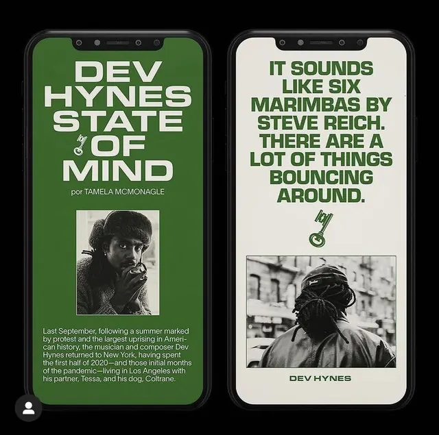
A two-phone mockup showing bold dark-green and cream layout with large headlines, black-and-white portrait photography, and supporting body text for a music article.
Summary
A mobile article layout for a music journalism feature about Dev Hynes, split across two phone mockups: one with dark sage green background, the other with cream, both using bold all-caps headlines and black-and-white photography.
Visual description
Two iPhone mockups displayed side by side against a neutral background. Left phone: dark sage green (#3B642A) background with large all-caps white headline "DEV HYNES STATE OF MIND" by Tamela McMonagle. Below is a black-and-white portrait photograph of the subject and supporting body text in light gray. Right phone: cream-colored (#E7E4DD) background with all-caps dark green headline "IT SOUNDS LIKE SIX MARIMBAS BY STEVE REICH. THERE ARE A LOT OF THINGS BOUNCING AROUND." Below is another black-and-white portrait photograph and supporting body text. Both layouts use generous vertical spacing and left-aligned text justified to generous margins. The geometric sans-serif typeface is uniform across both screens. Small decorative icons (resembling musical symbols or abstract shapes) appear as secondary accents.
Key takeaway
The bold alternation of background color (dark green to cream) across screen states creates visual rhythm and signals a transition or shift in content narrative. The pairing of large, tight-set headlines with fine body text creates hierarchy without visual noise. Black-and-white photography against saturated or neutral colors ensures photographic content never competes with typography. The all-caps treatment reinforces the editorial voice and works within constrained mobile width.
Reuse notes
Excellent for editorial, music, or cultural publishing on mobile. The dark green and cream palette is distinctly warm and confident, works particularly well for retrospectives or artist profiles. The two-card structure suits articles with shifts in perspective or multiple speakers. White space is generous, so this approach demands longer-form content to sustain pacing. Test this pattern with diverse skin tones and photographic subject matter to ensure legibility.
More like this


Keep what you find
A free account saves references to boards and can send you a weekly email of picks based on what you save.
To see every result, go Pro.