Preview image. Unlock full-res
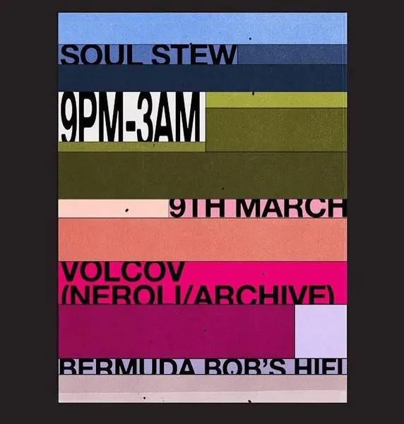
Horizontal color bands stacked atop each other, each hosting overlaid event text (dates, names, venues) in bold, all-caps sans-serif.
Summary
Horizontal color bands stacked atop each other, each hosting overlaid event text (dates, names, venues) in bold, all-caps sans-serif.
Visual description
Seven horizontal rectangular bands in muted, earthy hues (blues, olive, coral, magenta, blush) layer atop a dark background. Event text fragments overlap across multiple bands: "SOUL STEW" in dark caps spans the top; "9PM-3AM" and "9TH MARCH" sit at different heights; "VOLCOV [NEROLI/ARCHIVE]" and "BERMUDA BOB'S HIFI" anchor lower sections. The overlapping creates a playful tension between readability and visual density. Each band appears to be a separate information layer, with text anchored left or right.
Key takeaway
Information designed as visual rhythm. The overlapping text and color bands create a poster-like energy while remaining legible. Strong use of whitespace within each band and bold type weight prevents confusion. This approach works for events, editorial, or any multi-layered communication.
Reuse notes
Excellent for event posters, editorial spreads, music/cultural organizations, or museums. The retro-modern palette suggests curation and taste. Works best when the event details are truly layered (multiple dates, multiple performers, logistics). Avoid if simplicity is the goal.
More like this
Keep what you find
A free account saves references to boards and can send you a weekly email of picks based on what you save.
To see every result, go Pro.