Preview image. Unlock full-res
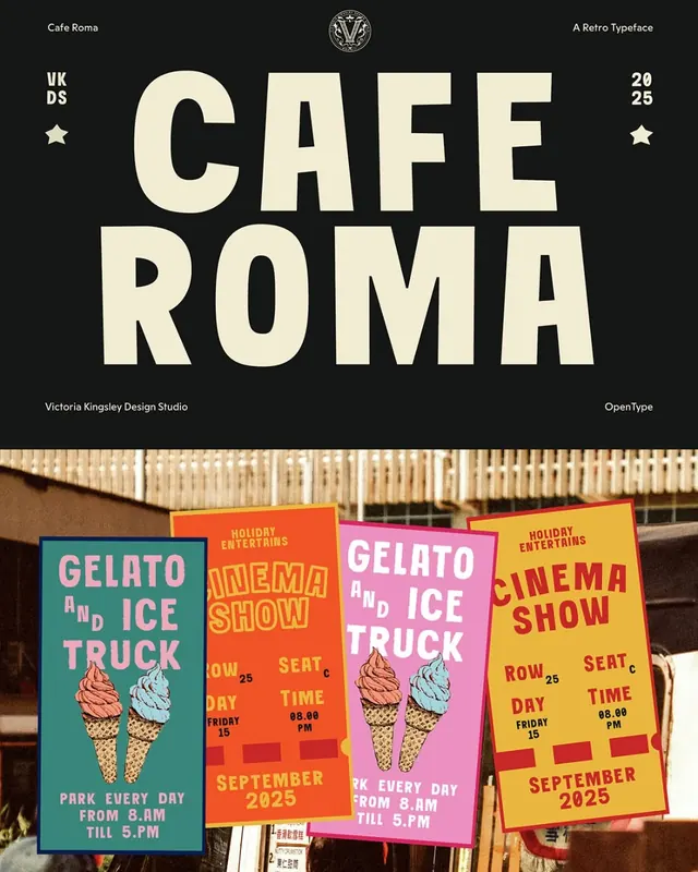
Type-specimen poster and event promotion flyers combining a bold slab-serif typeface (Cafe Roma) with vibrant, layered color-blocking and street photography for a cohesive cultural identity.
Summary
A two-part branding system: the upper section showcases "Cafe Roma" in a bold, warm-toned slab-serif typeface centered on black with heraldic accents, while the lower section displays stacked event posters with bright complementary colors (teal, magenta, orange, yellow) promoting gelato and cinema events.
Visual description
Upper half: "CAFE ROMA" set in large, high-contrast cream slab-serif (Cafe Roma font) on black background, with a small circular ornamental badge at top center and metadata text (designer credit, year "2025") positioned at corners. Lower half: four overlapping posters photographed on a wooden wall structure, each with loud color-blocked backgrounds and hand-drawn ice-cream/gelato illustrations. Teal poster pairs with orange; pink pairs with yellow. White or light-colored sans-serif text provides event details (dates, times, venue). The composition blends typographic refinement with bright, raucous street energy.
Key takeaway
The contrast between restrained modernist type treatment (upper) and exuberant, populist poster vernacular (lower) in a single coherent system. The warm beige-cream type on black creates legibility and prestige despite large size. Color-blocking on posters is bold enough to read at distance and from an angle (as on an actual street installation).
Reuse notes
Ideal for cultural venues, food brands, or event series that want to balance design authority (clean typography) with audience energy (bright color, playful subject matter). The slab-serif adds approachability to modernist structure. Works best when the event or venue genuinely carries both sophistication and joy; pastiche use risks looking confused.
More like this




Keep what you find
A free account saves references to boards and can send you a weekly email of picks based on what you save.
To see every result, go Pro.