Preview image. Unlock full-res
A 39-page employee handbook for Combo (a NYC strategy and design agency) built on a butter-yellow / sage-green / black palette, two contrasting serifs, a book-spread grid, and a running office-supplies illustration motif in flat yellow line art.
Summary
A 39-page employee handbook for Combo, a New York strategy and design agency, that reads like a printed book rather than a slide deck. Its personality comes from a tight three-color palette (butter yellow, sage green, black), a two-serif type system, a book-spread grid with running page numbers and lettered chapters, and a recurring office-supplies illustration motif rendered in flat yellow line art.
Visual description
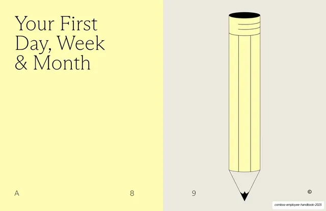
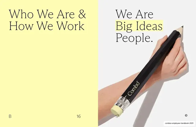
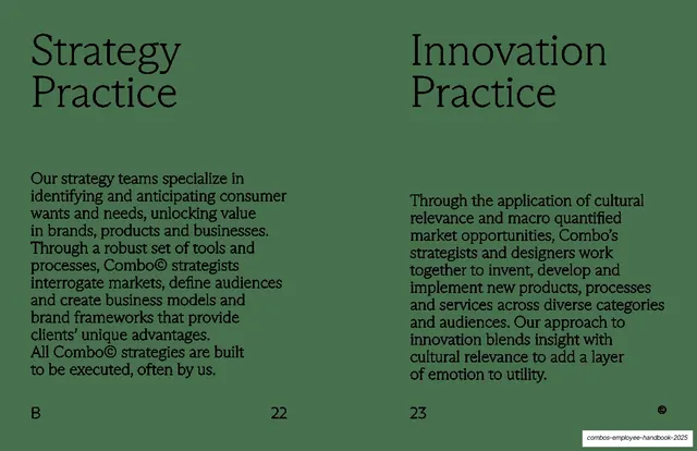
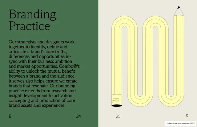
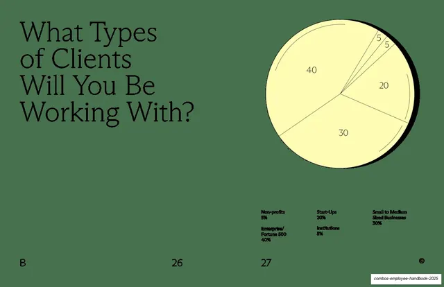
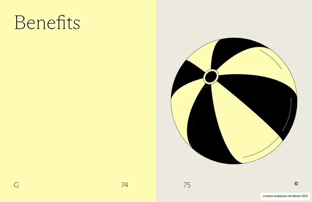
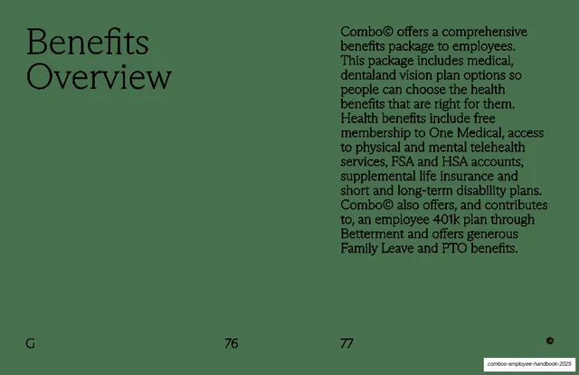
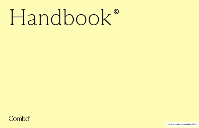
Pages are 16:9 and treated as book spreads: most slides carry two page numbers along the bottom (e.g. "10" and "11"), a lettered section cue bottom-left (A, B, C ...), and a small circled-© brand mark bottom-right. The palette swaps between butter yellow (#F8F1A8), a muted sage green (#5C7059), and pure black, with a pale grey-cream (#E9E6DC) used as the secondary field on illustrated dividers. Type is the strongest signature: oversized light humanist serif for headlines, almost always mixed case, paired with a sturdier slab-ish text serif for body copy set ragged-right in a narrow right column; small bold sans appears only for legends and inline labels. A circled-© is appended to wordmarks throughout ("Handbook©", "Combo©") as a quiet brand stamp, even occupying a near-empty slide on its own. Recurring layouts: a headline-left / body-right content spread on solid sage green; section dividers that split the page into a yellow title field and a contrasting field (pale grey with a flat-yellow line-art object, or flat black for a major break); two-column comparison spreads with mirrored serif headings; a monochrome yellow pie chart with hairline dividers and a multi-column legend; and full-bleed black statement slides carrying one centered white serif mantra. The illustration motif is consistent: stationery objects (a pencil, a binder clip, a pencil bent into a scribble, a giant branded pencil held in a real photo) all drawn in flat yellow line with black accents, tying the whole handbook to an office-supplies concept.
Key takeaway
The two-serif system (an airy display serif for headlines, a heavier text serif for body) doing all the hierarchy work without changing color or weight. The book-spread conceit, with real page numbers, lettered chapters, and an index that maps to repeated section letters, which makes a handbook feel like a designed object and gives readers wayfinding. The circled-© used as a repeatable brand glyph rather than a legal mark. And the single-motif illustration language, one family of flat-yellow stationery objects reshaped per idea, which keeps a long document playful and unmistakably on-brand. The deck also paces itself well: it alternates plain green text spreads with illustrated splits and rations its loudest moves (the black divider, the black quote slide) so contrast stays meaningful.
Reuse notes
A strong reference for employee handbooks, culture decks, internal brand books, and any long-form document that should feel warm and editorial instead of corporate. The headline-left / body-right green template is directly reusable for text-heavy pages; the yellow/contrast divider system and the lettered-section index give a long deck structure; the monochrome on-palette chart shows how to keep data graphics on-brand. The whole thing depends on a confident serif pairing and the unusual yellow/green palette; swapped onto default fonts and colors it would lose most of its character. The stationery motif is specific to a handbook concept, so re-theme the illustration family to fit a different subject. Needs genuinely good illustration and at least one well-shot branded prop to carry the visual halves.
From this deck: Combo Employee Handbook 2025
View deck