Preview image. Unlock full-res
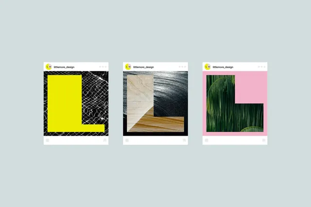
A lettermark identity shown in three distinct variations, each pairing a bold geometric letter with a contrasting textured or chromatic background: lattice, wood grain, and foliage.
Summary
Three lockup variations of a single geometric lettermark, each paired with a distinct textured or chromatic field to demonstrate adaptability: geometric lattice, warm wood grain, and vibrant foliage against hot pink.
Visual description
The image presents three Instagram-style post mockups arranged horizontally, each displaying a lettermark option. Left: a bold yellow letter set over dense black crosshatch or lattice texture. Center: warm tan wood-grain photo and navy linear-texture photo side by side, with a neutral tan letterform positioned across both. Right: vibrant kelly-green foliage photography, with a magenta letterform overlaid on a hot pink background section. Each mockup carries a small yellow-and-magenta brand logo (littlemore_design) in the header, framing the exploration as a cohesive system for a single brand.
Key takeaway
Using natural and geometric textures as background partners to a simple lettermark, showing how the same mark reads differently against contrasting visual fields; balancing bold color (magenta, neon yellow, hot pink) with earthy and monochromatic options to signal versatility; presenting logo variations in a grid mockup layout to demonstrate real-world application.
Reuse notes
Ideal for brands seeking a modern, organic sensibility with playful color energy. The texture-plus-letter strategy works well for agencies, design studios, or brands with a strong visual voice. The mockup format is useful for pitch decks or brand guidelines; adapt to client colors. Avoid if a more minimal, corporate identity is the goal.