Preview image. Unlock full-res
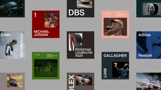
Portfolio directory structured as an irregular mosaic grid, mixing photography, color-blocked cards, and typographic panels to showcase diverse creative work.
Summary
Portfolio directory arranged as a free-form mosaic grid, mixing bold brand names, portrait thumbnails, project photography, and solid-color accent cards (green, coral, navy, red) on a neutral background.
Visual description
A gray background holds a series of overlapping card-like elements in irregular grid alignment. Named brand logos and labels appear frequently: Michael Jordan, DBS, Christian Louboutin SS20, Gallagher, Reebok, Adidas. Photography fills several cards - candid portraits, shoes, athletic action shots. Saturated color-blocked cards in forest green, coral, navy blue, and crimson punctuate the arrangement. Text and image densities vary widely across cards: some are primarily typographic, others image-dominant. No two cards are perfectly aligned, creating visual rhythm without chaos. Sans-serif type is tight and legible. The overall effect is curated and intentional despite the irregular spacing.
Key takeaway
How solid-color accent cards (especially the forest green, coral, and navy) break up photographic and typographic density without looking chaotic. The variety of card sizes and densities, which suggests a living directory that can accommodate new entries. The restraint in color palette - despite the colorful blocks, everything feels cohesive. Using name labels prominently for memorability (brand/person recognition). The neutral gray background allows the foreground elements to pop without competing.
Reuse notes
Perfect for portfolio sites, talent agencies, media collectives, or design studios showcasing multiple creators/projects. Works best when entries are well-photographed and names/titles are clear. Requires careful cropping and layout iteration to avoid looking cluttered. The mosaic approach works less well for e-commerce (where consistency matters more) and better for editorial/creative contexts. Accent colors should be limited to 3-5 to maintain cohesion.
More like this




Keep what you find
A free account saves references to boards and can send you a weekly email of picks based on what you save.
To see every result, go Pro.