Preview image. Unlock full-res
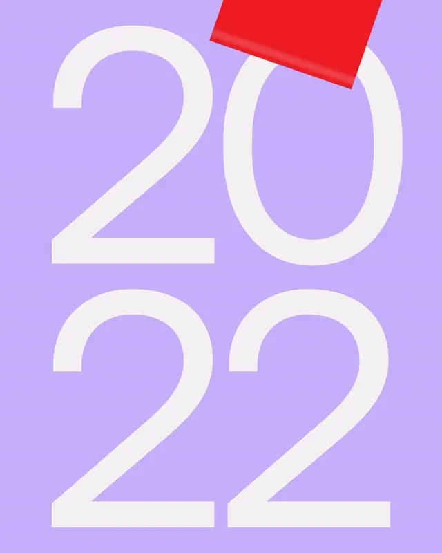
Year 2022 rendered in oversized open letterforms in cream against a lavender background, with a red geometric shape floating above as punctuation.
Summary
Year 2022 rendered in oversized open letterforms in cream against a lavender background, with a red geometric shape floating above as punctuation.
Visual description
Vertical composition with "2022" stacked: "20" occupies the upper half, "22" the lower half, all in large outlined cream numerals with generous counter-space. The background is a soft periwinkle lavender. A bright coral-red geometric rectangle hovers in the upper-right corner at a slight angle, acting as a graphic punctuation or accent. The typeface is modern sans-serif with clean, open lines. Color contrast is high between the cream numerals and cool purple ground, with the warm red shape adding visual pop without compromising hierarchy.
Key takeaway
Using geometric shape as visual punctuation or graphic accent; the weight given to negative space inside letterforms to make them read as "display" or poster-scale; how a single secondary color (the red) anchors attention and breaks up a two-color palette without feeling chaotic.
Reuse notes
Strong template for institutional, year-forward, or campaign-based calendars, reports, and event materials. The minimal color palette is reusable and the technique scales to other numerals or short headline text. Works best at large scales where counter-space and clarity matter most.
More like this


Keep what you find
A free account saves references to boards and can send you a weekly email of picks based on what you save.
To see every result, go Pro.