Preview image. Unlock full-res
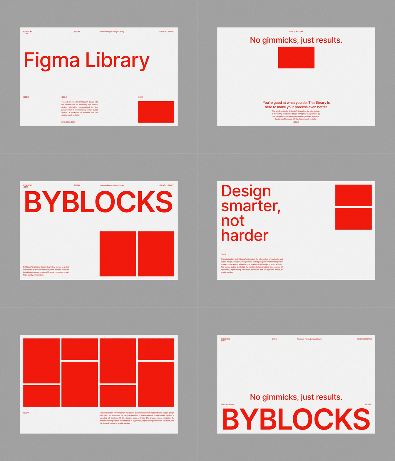
Minimalist type specimen sheet for Figma Library with bold red display headline, descriptive body text in small caps, and a solid red block as compositional anchor.
Summary
A type specimen grid showing "Figma Library" as a bold red display headline, surrounded by gray small-caps labels and body text describing the typeface philosophy, with a solid red rectangle anchoring the lower right.
Visual description
Cream-white background with gray border. The layout uses a structured grid. At the top in small caps: "STYLOCKS.COM" (left), "FIGURE" (center), "Premium Figma Design Library" (right). The main headline "Figma Library" is set in large, confident red sans-serif display type, positioned center-left. Below it, body copy in small gray sans-serif caps describes the design philosophy and intersection of modernism with classical proportions. Three red small-caps callouts sit at the baseline. On the right side, a solid bright red rectangle provides compositional weight and color anchor. The grid spacing and asymmetric placement of text and solid color create visual clarity without decoration.
Key takeaway
Bold sans-serif in large size reads immediately; the small-caps body copy establishes hierarchy without visual clutter. A single saturated color (red) on a neutral background creates striking contrast; the solid red rectangle balances the large text area and completes the composition. The grid structure—while invisible—makes the layout feel organized despite asymmetry.
Reuse notes
Effective for design-tool, SaaS, or agency brands where sophistication and clarity matter. The small-caps label system works well for technical documentation or feature showcases. Use when you need high contrast and confidence without ornament.
More like this

Keep what you find
A free account saves references to boards and can send you a weekly email of picks based on what you save.
To see every result, go Pro.