Preview image. Unlock full-res
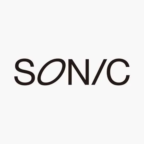
Bold sans-serif wordmark SONIC with generous stroke weight and curved letterforms, centered on a soft off-white background.
Summary
A substantial sans-serif wordmark SONIC in black with soft curved letterforms, presented large and centered on a neutral light ground.
Visual description
"SONIC" rendered in a single-stroke, curved sans-serif typeface with generous character width and consistent line weight. All letters are black with rounded terminals (the O and C especially) and flowing curves that soften the geometric baseline. The mark sits centered on an off-white background, with ample negative space on all sides. The scale is large relative to the frame, emphasizing the letterforms' form. No secondary marks, colors, or supporting text.
Key takeaway
The balance between bold weight and curved, approachable letterforms. The confident centering and scale give the mark authority without rigidity. The consistent stroke and open letter spacing make it highly legible at size and in reproduction.
Reuse notes
Works for brands seeking modern professionalism without coldness. Best where a single typeface suffices and you can rely on large-scale presentation (signage, headers, primary marks). The curved sans suits tech, creative, and lifestyle sectors equally.
More like this



Keep what you find
A free account saves references to boards and can send you a weekly email of picks based on what you save.
To see every result, go Pro.