Preview image. Unlock full-res
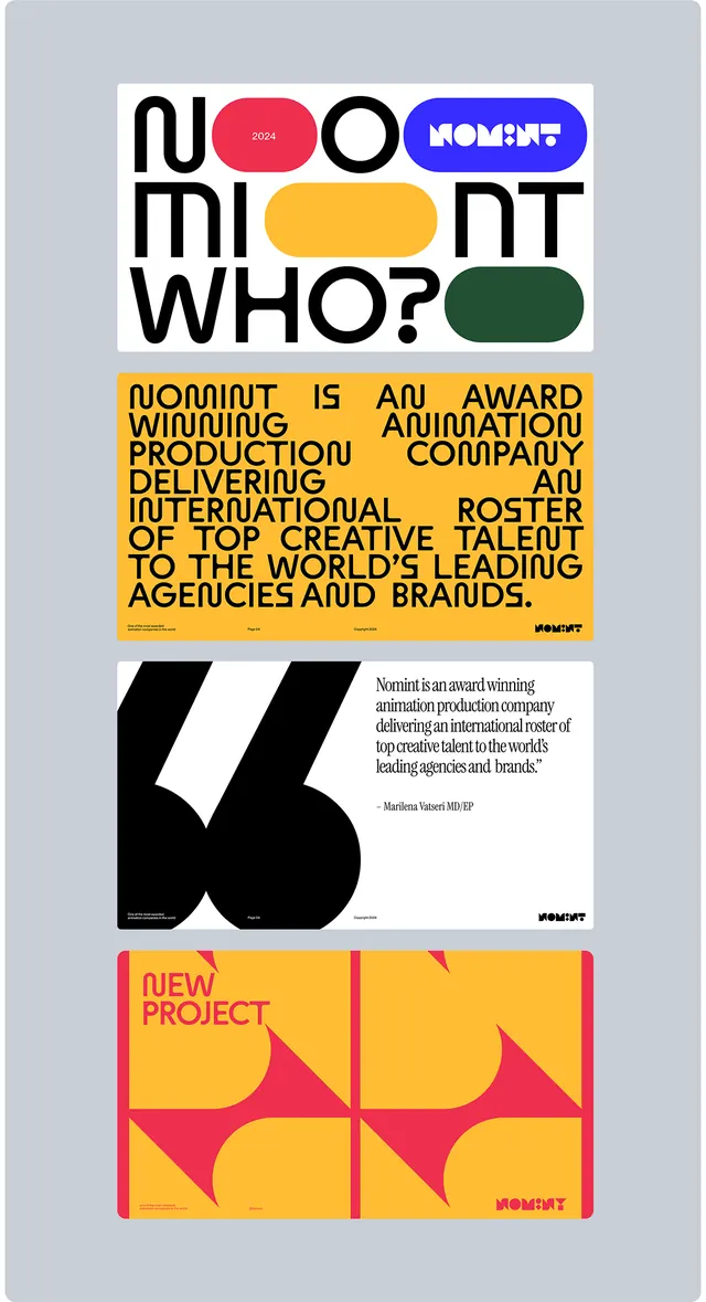
Logo presentation for a design award brand (Noummint) layering bold sans-serif typography with nested colored geometric shapes and a modular grid layout.
Summary
A modular brand-identity poster for Noummint stacking bold sans-serif text with colored geometric ovals as logo marks, yellow informational band, a large "6" numeral, and a zigzag pattern footer.
Visual description
The composition uses a vertical stacking strategy with three distinct typographic/graphic zones on a gray background. The header pairs the wordmark "NOUN MINT WHO?" in black sans-serif with a set of nested colored ovals (pink, blue, orange, green) positioned to the right of each line. A bright yellow band below contains small black body text describing Noummint as a design award. The middle section features a large geometric "6" in black. The footer is a modular grid of angular shapes in yellow, pink, and magenta, creating a dynamic zigzag pattern. All text is clean sans-serif with optical spacing.
Key takeaway
The stacking of type with aligned geometric marks for cohesion, the use of a single accent color band as an information barrier, and the transition from typographic to purely geometric pattern as a visual footer.
Reuse notes
Effective for award submissions, portfolio identities, or design-studio brand work. Modular enough to adapt the footer pattern to other categories.