Preview image. Unlock full-res
Quant's July 2020 corporate identity system pairs a bold, compact sans-serif wordmark with clean typography guidelines, establishing a technical yet elegant brand language.
Summary
Quant's July 2020 corporate identity system pairs a bold, compact sans-serif wordmark with clean typography guidelines, establishing a technical yet elegant brand language.
Visual description
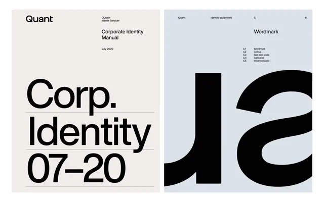
The left panel shows the cover of a corporate identity manual, featuring "Quant Master Servicer" and "Corp. Identity 07-20" printed in a bold, geometric sans-serif on a cream background with thin horizontal rules separating sections. The right panel reveals a brand guidelines page on light blue background, titled "Wordmark" with the "Corp." wordmark displayed large and bold in pure black, followed by a structured legend (C1-C5) documenting the wordmark's variants, color usage, sizing rules, and incorrect applications.
Key takeaway
The wordmark's geometric compactness and weight progression from the lighter "C" into the heavier "orp" letterforms creates visual hierarchy without decoration. The cream-and-blue color split between cover and guidelines is unexpected and memorable. The methodical footnote system (C1, C2, C3) for documenting logo usage variants is scalable and prevents misapplication.
Reuse notes
Works well for B2B, fintech, or analytics brands that benefit from a technical, trustworthy appearance. The extreme thinness of the typography rules is striking but requires high print resolution; test carefully if adapting the visual language for screen.
More like this






Keep what you find
A free account saves references to boards and can send you a weekly email of picks based on what you save.
To see every result, go Pro.