Preview image. Unlock full-res
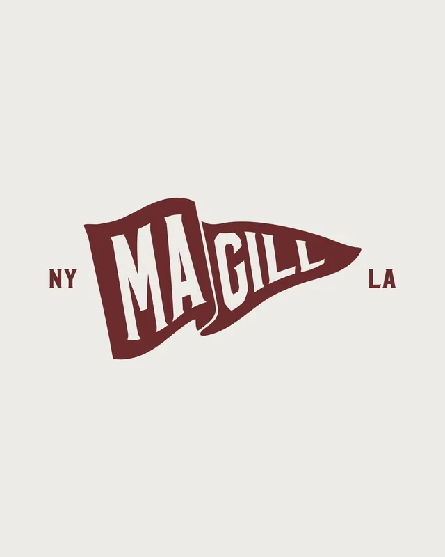
Collegiate pennant logo with white serif lettering in a maroon triangular shield, regional identifiers NY and LA flanking the wordmark.
Summary
Collegiate pennant logo with white serif lettering in a maroon triangular shield, regional identifiers NY and LA flanking the wordmark.
Visual description
A maroon-red triangular pennant shape on a cream background, pointing to the right. Inside the maroon triangle sits "MAGILL" in a custom serif typeface with a thick stroke and slight angle variation, rendered in off-white. The letters have a slightly compressed, geometric serif quality that suggests mid-century collegiate athletics. Flanking left and right outside the triangle are small caps "NY" and "LA", indicating regional presence or franchises. The maroon is a deep burgundy tone that reads as authoritative and heritage-forward.
Key takeaway
The pennant shape is a compact, directional emblem that signals team/institution/regional identity without needing a complex mark. The serif letterforms with visible stroke weight give it substance and vintage credibility. Placing geography labels outside the primary mark keeps the logo tight while expanding context.
Reuse notes
Strong template for sports teams, regional organizations, and educational institutions. The maroon and cream combo has strong collegiate/heritage associations; substitute colors only if the new context shares a similar prestige positioning. The serif weight can feel dated if the rest of the brand is too modern, so pair with complementary typography elsewhere.
More like this







Keep what you find
A free account saves references to boards and can send you a weekly email of picks based on what you save.
To see every result, go Pro.