Preview image. Unlock full-res
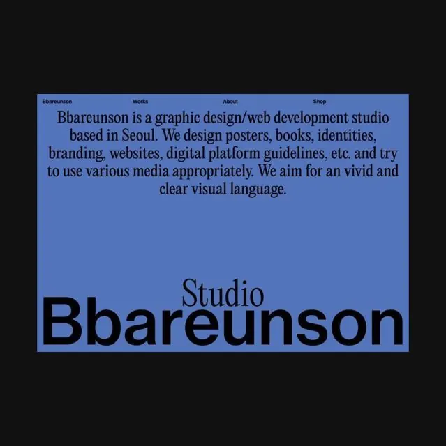
A graphic design studio website identity using bold sans-serif logotype in navy on a periwinkle background, paired with serif body copy describing the studio's services.
Summary
A graphic design studio website identity using a bold navy sans-serif logotype on a periwinkle background, paired with serif body copy describing the studio's multidisciplinary services.
Visual description
Top bar features a minimalist navigation in small sans-serif type: "Bbaareunson", "Works", "About", "Shop". Main area is divided into two text blocks in different typefaces: a lighter serif paragraph describing the studio's practice (posters, books, identities, branding, websites, digital platform guidelines, media appropriateness) positioned upper-center, and a dramatically oversized dark navy sans-serif logotype "Bbaareunson" (with "Studio" in lighter serif above) anchoring the lower two-thirds. The periwinkle background creates contrast between the text weights and scale, emphasizing the logotype as the primary visual anchor.
Key takeaway
The contrast between a large, bold wordmark and refined serif descriptive text creates hierarchy and personality without clutter. Using typeface and scale contrast rather than color variation or graphic elements to establish visual interest. The navigation bar's restraint (small, minimal color difference) keeps focus on the main logo composition.
Reuse notes
Effective for creative studios prioritizing typography and clarity over decorative imagery. Works well for web presence that needs to convey sophistication and diverse capabilities. The mixed serif/sans approach reads as cultured and contemporary for design-forward audiences.