Preview image. Unlock full-res
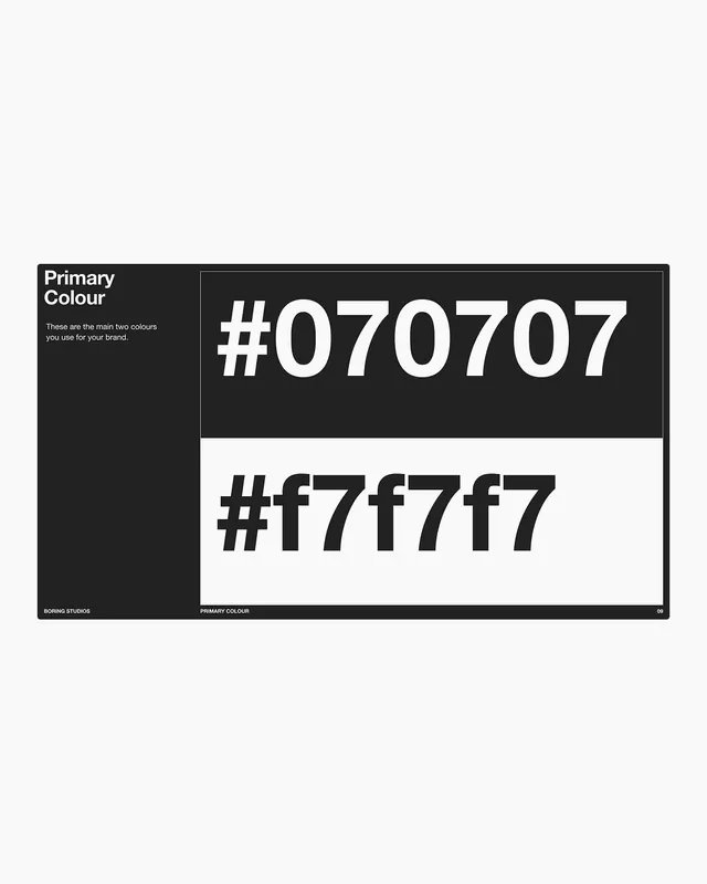
Brand guideline page documenting a primary color palette with paired hex codes displayed against dark and light backgrounds for maximum legibility contrast.
Summary
A stark brand-guideline page documenting a single primary color as two hex values, one rendered on near-black and one on white to demonstrate the color's contrast range.
Visual description
Left column titled "Primary Colour" with descriptive text. Right column shows two large color swatches: the top swatch is very dark charcoal with white oversized sans-serif hex code #070707, the bottom is off-white with dark sans-serif hex code #f7f7f7. A thin vertical rule divides the columns. Footer text identifies the page as by Boring Studios, labeled "Primary Colour", numbered page 09. All type set in a clean, modern sans-serif.
Key takeaway
The split-swatch layout showing the same color on opposite-value backgrounds to verify contrast and readability. The bold, large hex presentation makes the value unmissable. The minimal typographic hierarchy and abundant white space keeps focus on the color itself.
Reuse notes
Ideal for a brand color spec or design-system documentation where the primary color must work on both dark and light surfaces. Works well as a single-page reference or printed guide. Not suitable for palettes with many colors; better for highlighting one or two hero colors.
More like this








Keep what you find
A free account saves references to boards and can send you a weekly email of picks based on what you save.
To see every result, go Pro.