Preview image. Unlock full-res
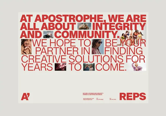
Mission-driven corporate identity merging bold red all-caps sans-serif with candid documentary photography woven directly into the text layout.
Summary
Mission-driven corporate identity merging bold red all-caps sans-serif with candid documentary photography woven directly into the text layout.
Visual description
A cream background hosts a typographic manifesto in bold red capital letters. The text states: "AT APOSTROPHE, WE ARE ALL ABOUT INTEGRITY AND COMMUNITY. WE HOPE TO BE YOUR PARTNER IN FINDING CREATIVE SOLUTIONS FOR YEARS TO COME." Six to eight small rectangular photographs of people (candid, cropped close) are inserted at intervals between the words, breaking the typographic field into rhythmic sections. Below, small footers display the Apostrophe and REPS wordmarks in the same red, with contact details. The typeface is a heavyweight, geometric sans-serif with generous x-height, occupying roughly 60 percent of the poster's vertical space. The warm neutral palette (cream, red, and muted skin tones in the photos) creates cohesion without coldness.
Key takeaway
The integration of documentary photography directly into the text field gives the mission statement emotional weight without needing decorative elements. The photos break visual monotony and signal human-centered values through images rather than empty language. The oversized bold type remains legible and commanding even when interrupted.
Reuse notes
A strong pattern for mission-driven brands, agencies, and nonprofits needing to express values visually and verbally at once. The portrait interruption works best when the images are candid and diverse, reinforcing the stated community commitment. This approach demands generous size to maintain type legibility around the photographic cutouts.
More like this



Keep what you find
A free account saves references to boards and can send you a weekly email of picks based on what you save.
To see every result, go Pro.