Preview image. Unlock full-res
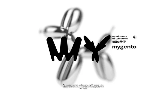
Mygento brand identity layering sharp black geometric type over a soft-focus hand illustration, signaling human guidance in technology.
Summary
Mygento brand identity layering sharp black geometric type over a soft-focus hand illustration, signaling human guidance in technology.
Visual description
A muted grayscale photograph of an open hand with fingers spread, rendered soft and blurred in the background. Sharp black sans-serif letterforms spelling "mygento" are layered over the hand in the center, with a registered trademark symbol anchoring the top right. Above the mark, a small serif or transitional typeface reads "conductors of tomorrow" in English with Japanese text (Ashita no Guide) below. Supporting copy at the bottom describes the brand's eCommerce platform work. The composition balances organic form (the hand) against geometric precision (the type), with significant whitespace around the mark itself.
Key takeaway
The soft-focus photographic background paired with sharp geometric type creates immediate depth and focus without requiring a separate background treatment. The hand symbol is memorable and metaphorical for the service (conducting, guiding, orchestrating). The bilingual presentation (English + Japanese) and tagline positioning above the wordmark establish authority and clear positioning in a compact space.
Reuse notes
Strong for tech brands, eCommerce platforms, or services that position themselves as human-centered or advisory. The blurred/sharp contrast works especially well when you need to anchor type over a busy or photographic base layer. Use when you want a symbol that reads as organic and guiding rather than purely geometric or sterile.
More like this





Keep what you find
A free account saves references to boards and can send you a weekly email of picks based on what you save.
To see every result, go Pro.